Protocolo de diseño de World
Principios, pautas y recursos
Principios del diseño
Humano
La convicción de que las cualidades orgánicas e impredecibles de la condición humana son fundamentales para la innovación.
Universal
Un lenguaje visual que garantiza la inclusión, la accesibilidad y la conexión global.
Optimista
Creer en la humanidad y en el papel que la tecnología puede desempeñar para empoderar a todos.
Perspectiva general de la marca
Todas las herramientas existen bajo la marca principal, que es World.


Identidad visual
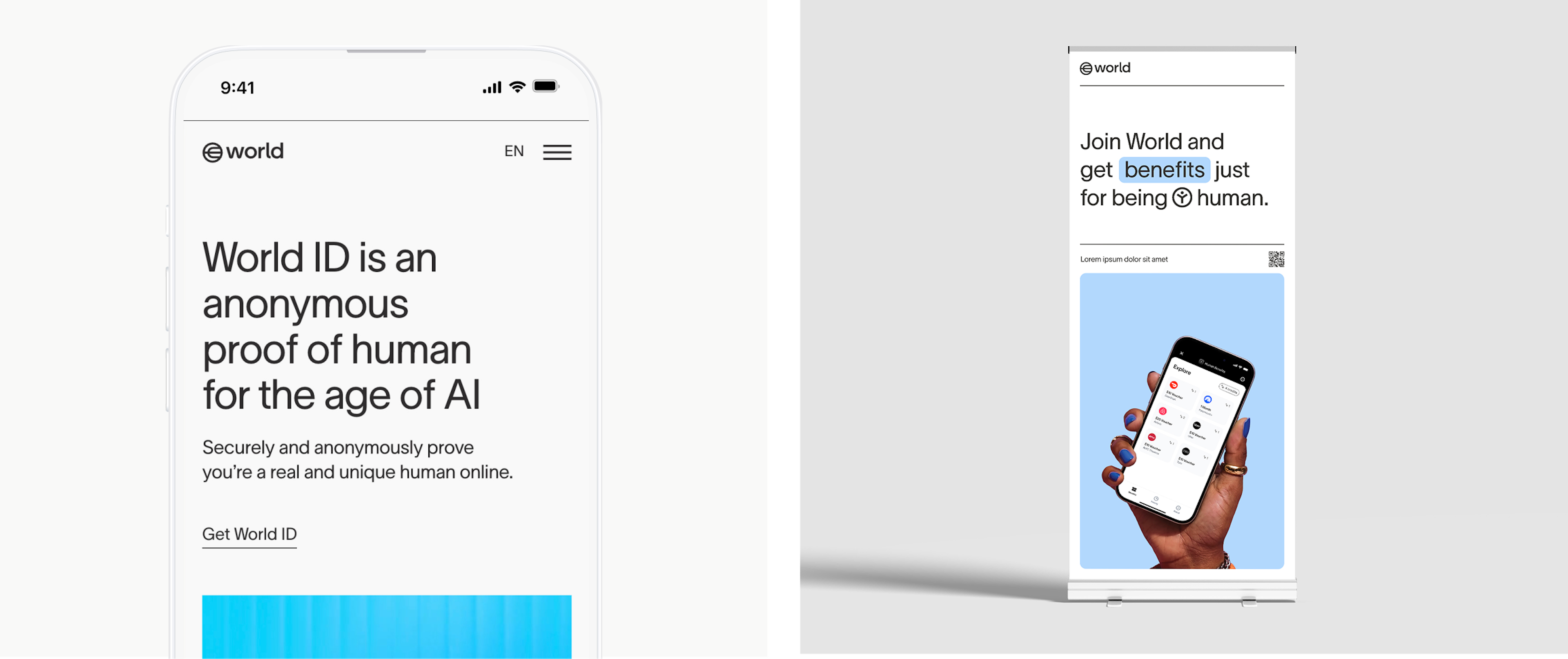
Logo de World
El logo de World es el ancla visual de nuestra marca: es simple, claro y universal. Basándose en principios de diseño atemporales, encarna nuestro compromiso con la accesibilidad, la innovación y la conexión global.
Nuestro isotipo es la representación principal de la identidad de nuestra marca. Siempre utiliza el logo en su forma original y mantén un espacio libre a su alrededor para asegurar visibilidad e impacto. Las modificaciones, distorsiones o uso de colores no autorizados pueden comprometer su integridad.


Nuestro logo textual es un componente clave de la identidad visual de nuestra marca que funciona en armonía con el símbolo del logo para comunicar nuestro nombre con claridad y estilo. No se permite alterar, estirar ni aplicar efectos no aprobados al logo textual.


El logo completo combina el símbolo del logo y el logotipo textual para crear un diseño unificado que representa nuestra marca en su forma más completa. Esta composición debe usarse siempre tal como se proporciona, manteniendo proporciones, espaciado y alineación correctos entre los elementos. Evita separar, reorganizar o cambiar el tamaño de los componentes de forma independiente. Consulta siempre las pautas de tamaño, espaciado y ubicación para preservar su integridad.


El espacio libre es el espacio mínimo entre el logo y cualquier otro elemento en un diseño. El ancho de la “o” en World define el espacio libre que rodea el logo.
Qué hacer con el logo y el color


Qué no hacer con el logo y el color


Al mostrar colaboraciones o alianzas, el logo de World puede combinarse con el logo de otra marca en los siguientes formatos.
Colores


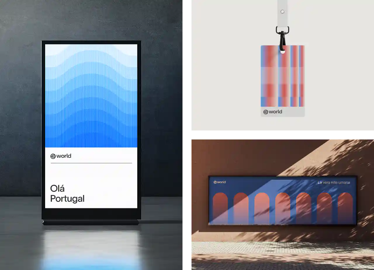
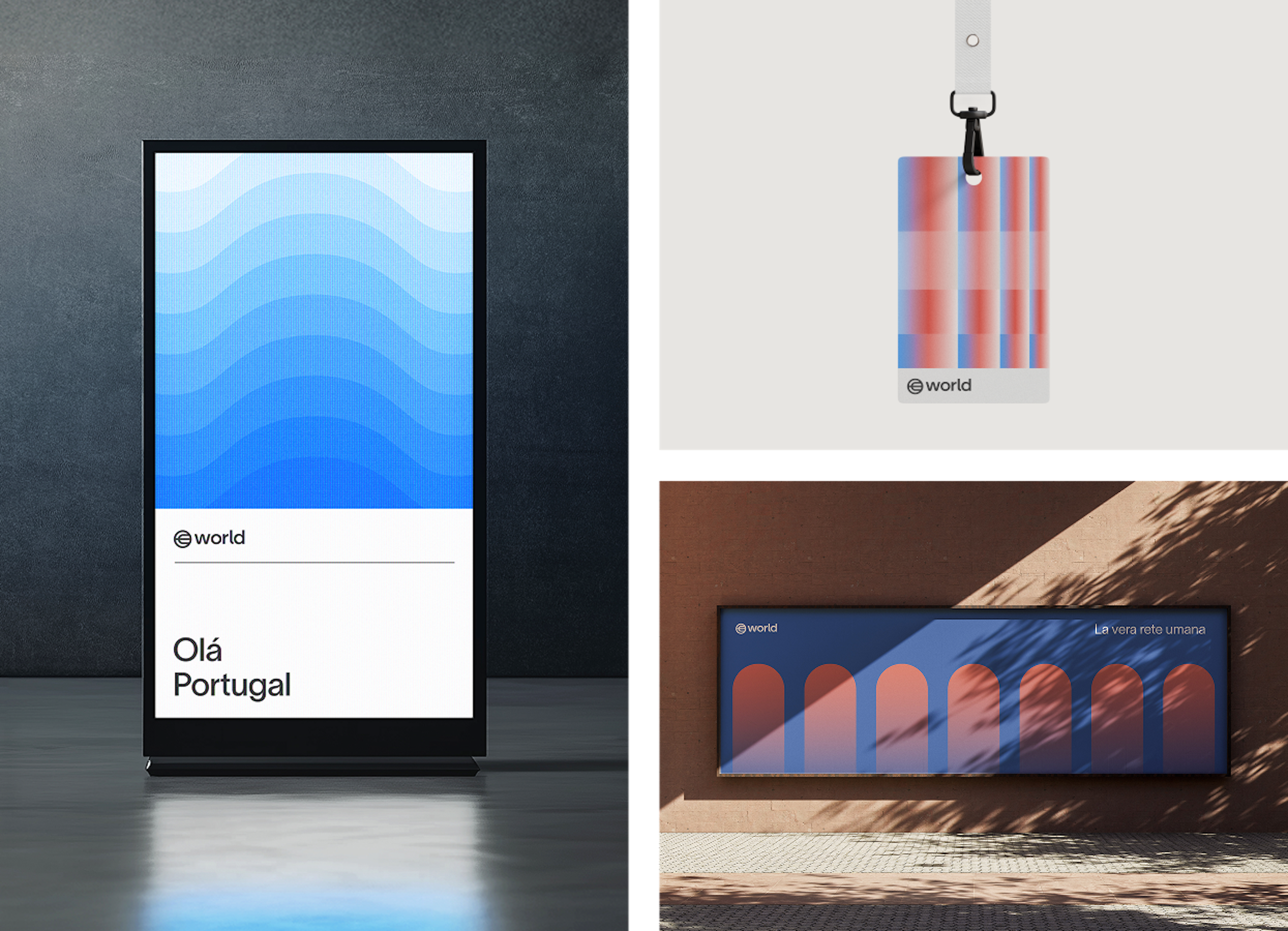
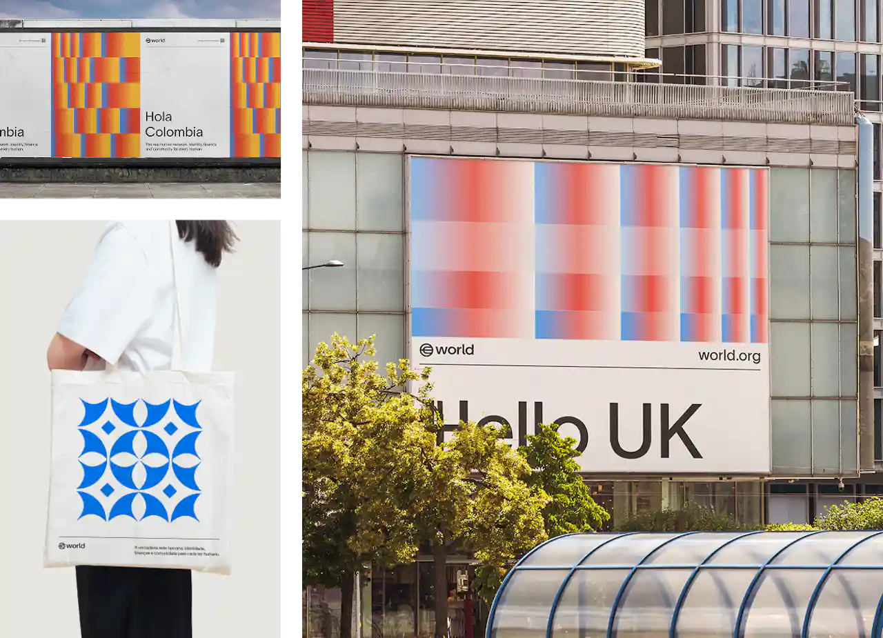
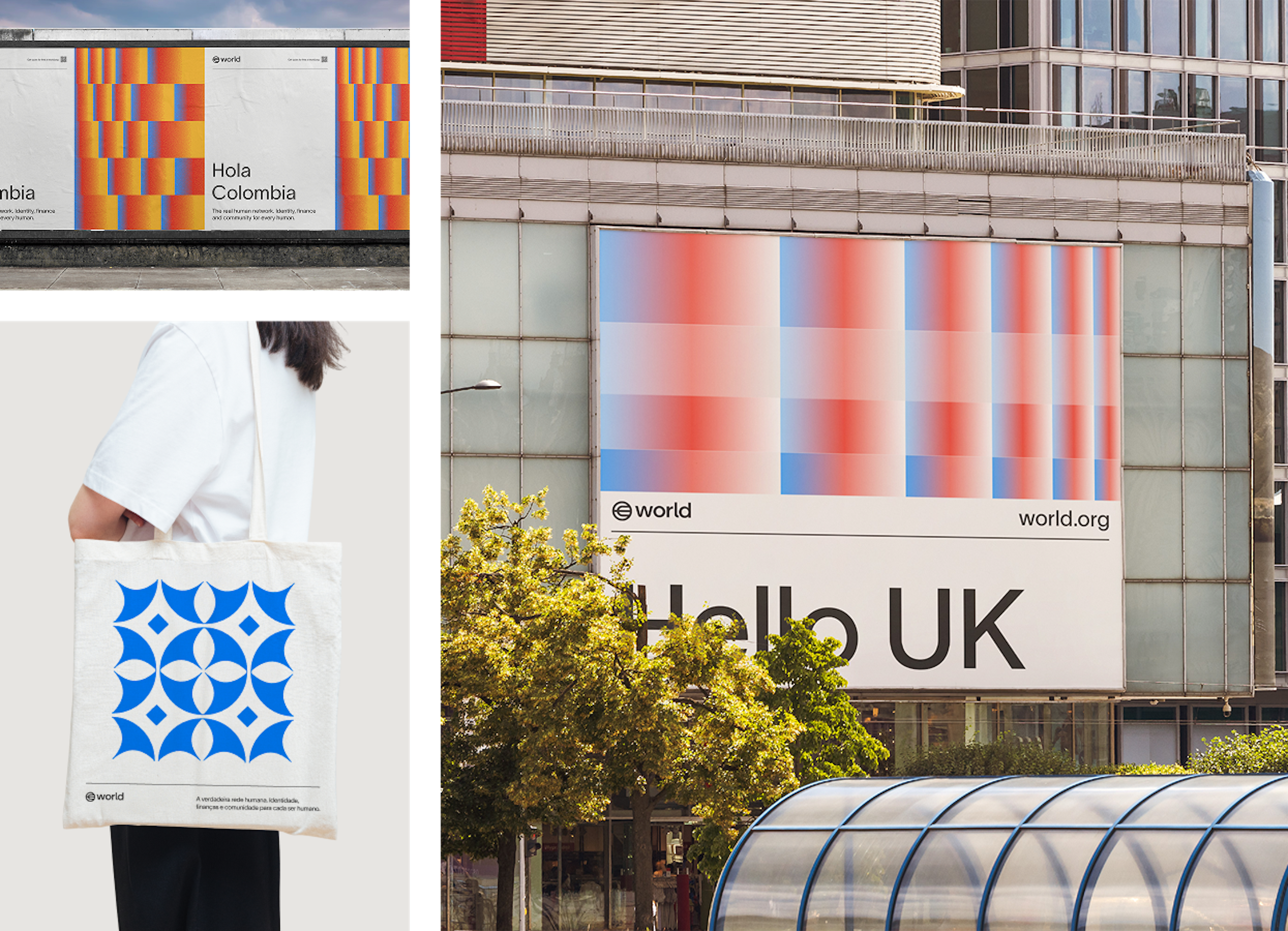
Los colores secundarios se utilizan con fines tanto expresivos como utilitarios dentro de la marca World. Entre los ejemplos se incluyen: la codificación de colores para distinguir distintos niveles de acceso en identificaciones de eventos, los colores degradados localizados para los materiales de lanzamiento, la semántica de color en las interfaces de usuario y los elementos visuales expresivos de apoyo.
Tipografía
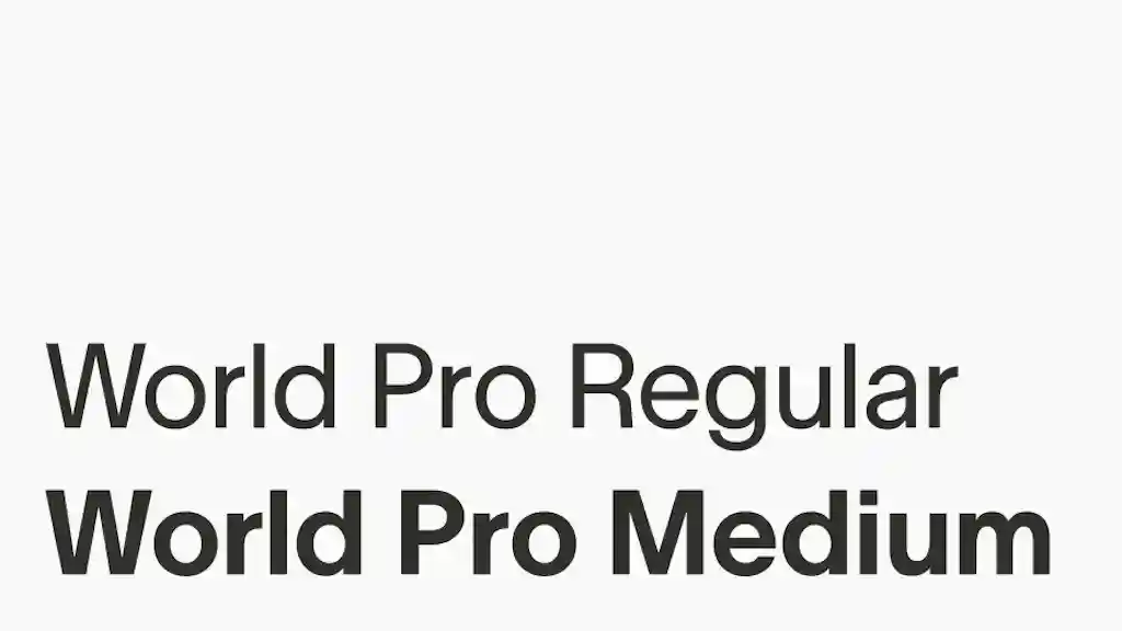
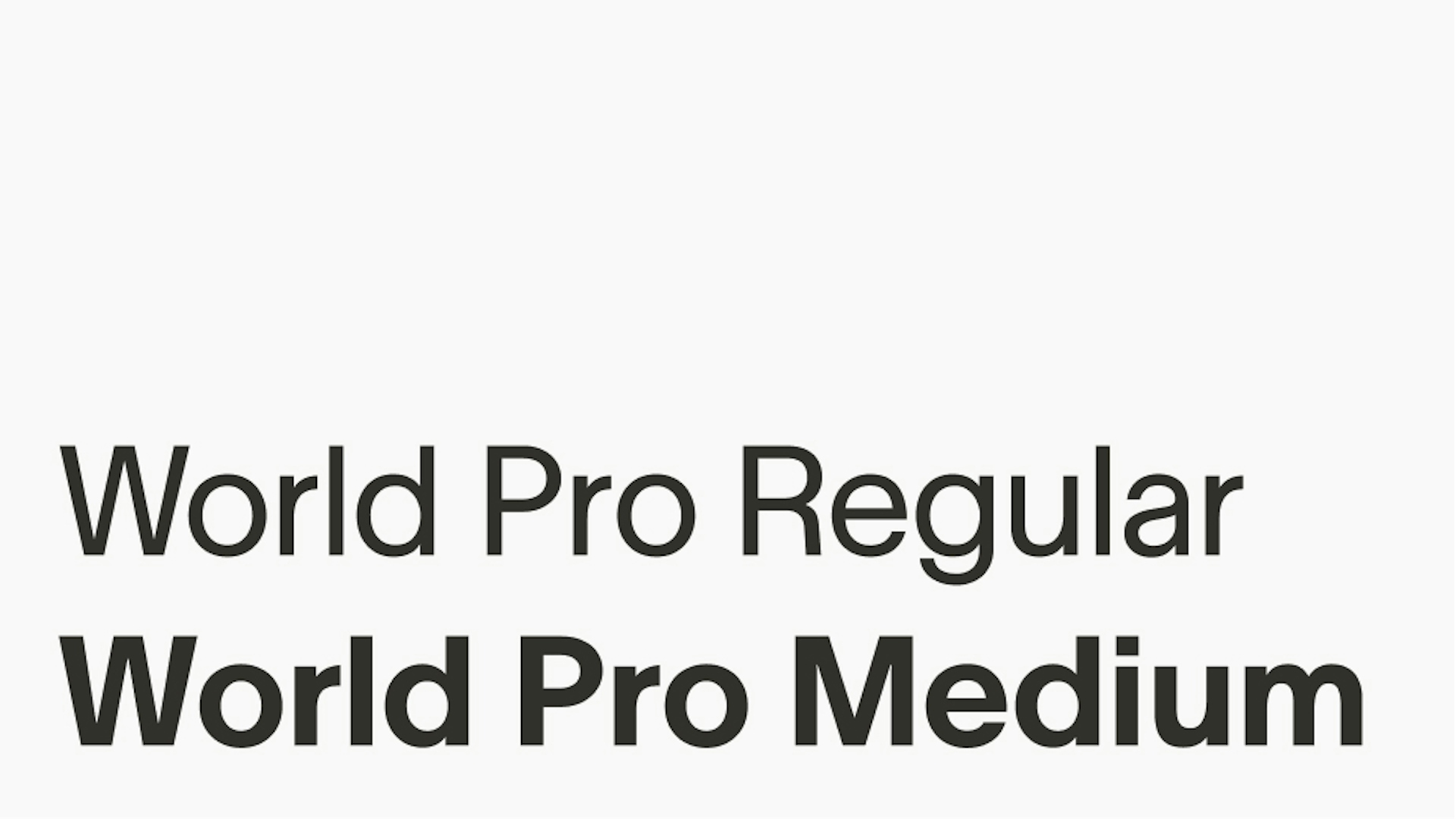
World Pro fue creado a medida para escalar y proporcionar un sistema visual universal para todos los que usan, integran e interactúan con World. Es la única tipografía utilizada en la marca World.


Pesos
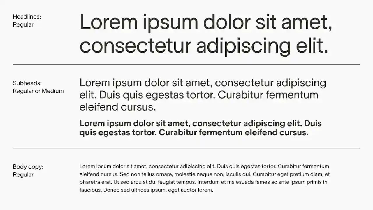
World Pro cuenta con dos pesos: Regular y Medium. Regular es el que se utiliza con mayor frecuencia, mientras que Medium funciona como un realce cuando se necesita dar énfasis.
Interlineado y espaciado de caracteres


Alineación


World Pro Regular generalmente se considera lo suficientemente versátil como para funcionar en títulos y cuerpo de texto, usando el tamaño para crear jerarquía.
World Pro Medium puede usarse para subtítulos pequeños cuando se necesita más peso.


Utilizamos la fuente Noto junto a nuestras tipografías latinas principales para garantizar un soporte integral a todas las caligrafías no latinas. Noto fue seleccionada por su amplia cobertura de idiomas globales, ofreciendo una tipografía consistente y visualmente armoniosa para diversas escrituras, como el chino, el árabe, el cirílico y el japonés.
Este enfoque nos permite mantener la consistencia e inclusión de la marca para asegurar que nuestra comunicación llegue a usuarios de todo el mundo en sus sistemas de escritura nativos, sin comprometer la legibilidad ni la coherencia estética.


En situaciones limitadas donde Lausanne no está disponible, por ejemplo, en Google Slides, se puede utilizar una tipografía alternativa de la biblioteca de Google Fonts: Para el texto de cuerpo, se emplea la fuente Inter; y para los titulares, se emplea la fuente Inter Tight. Únicamente estas fuentes de la biblioteca de Google Fonts están permitidas, y solo cuando no sea posible usar Lausanne.


Composición
La cuadrícula es una de las herramientas más importantes dentro del sistema de diseño. Es indispensable para la elaboración de todos los diseños y composiciones, por lo que debe utilizarse en todo momento. La elección de una cuadrícula de 2, 4, 6 u 8 columnas dependerá del tamaño del lienzo y de la cantidad de elementos que contenga. Sin embargo, todos los elementos de una composición deben estar alineados a la cuadrícula base y espaciados de forma proporcional a los márgenes.


Materiales internos
Para todos los materiales internos y recursos de la marca, en aquellos casos en que el logo aparece junto a otros recursos y contenido, el logo se ubica en la esquina superior izquierda del diseño para asegurar la consistencia.


Logo en solitario
En diseños donde el logo es el único elemento, como tarjetas de video o ciertas campañas o comunicados, el logo se utiliza en el centro del diseño.


Perfiles de redes sociales


Ilustración
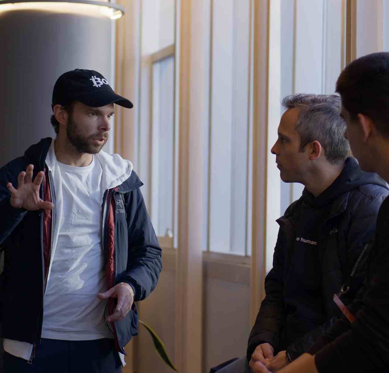
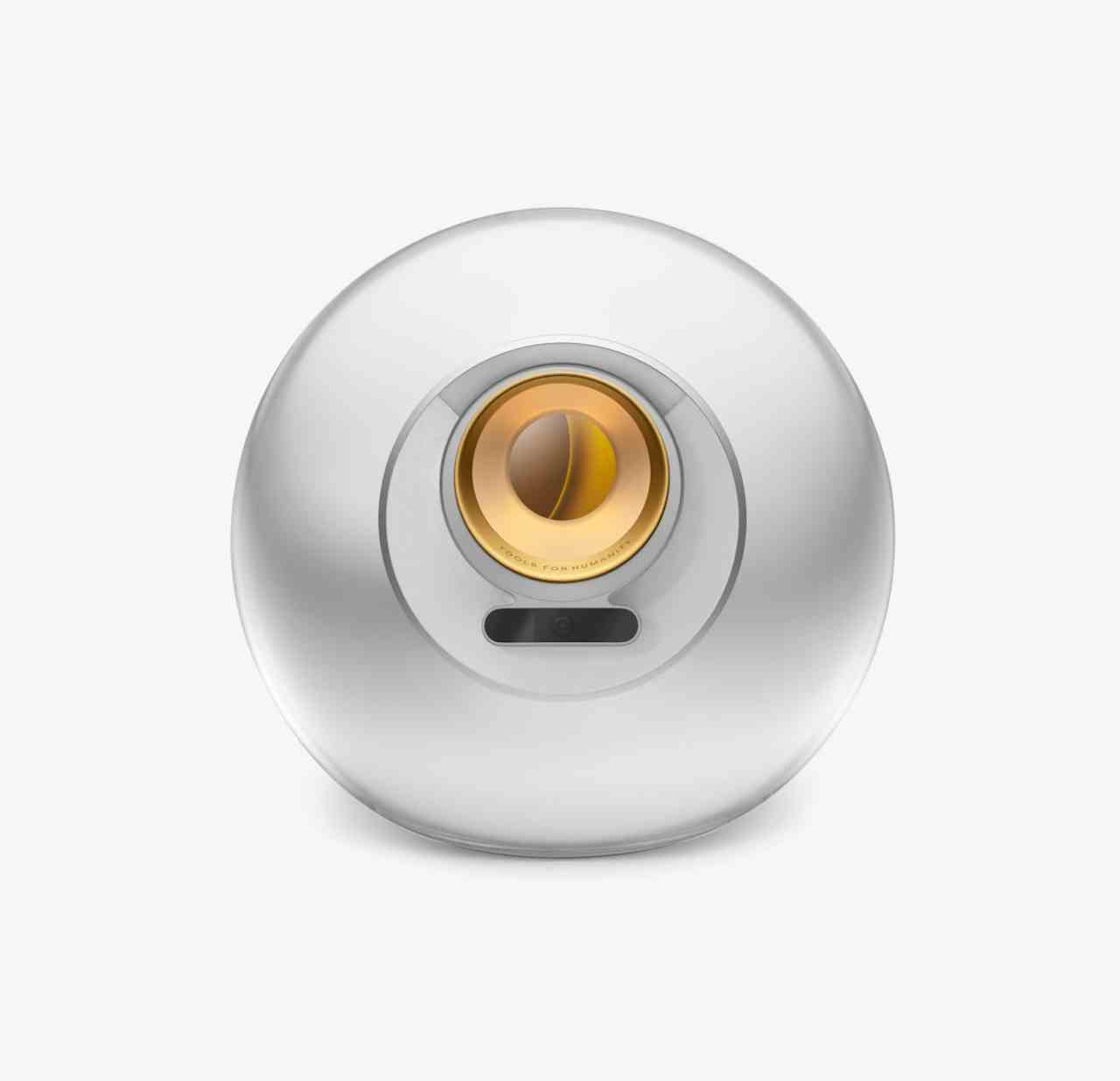
Cada uno de los productos principales de World tiene una ilustración asociada, derivada de la naturaleza del producto o su propuesta.


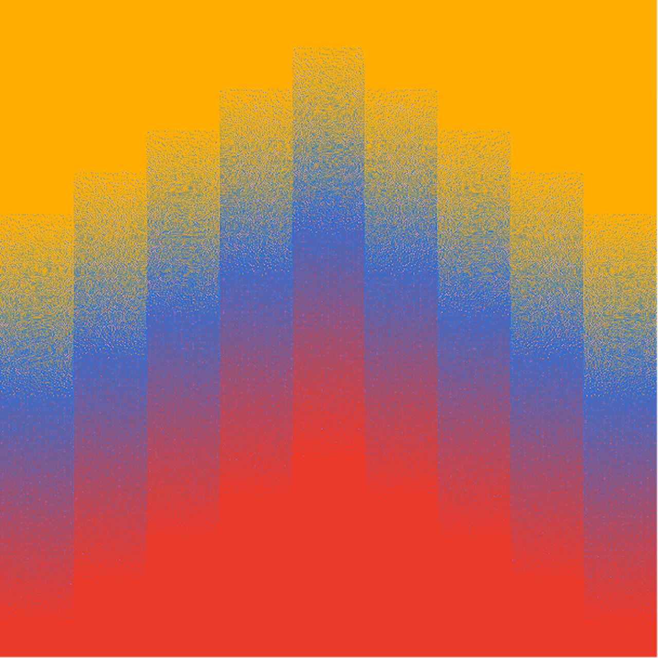
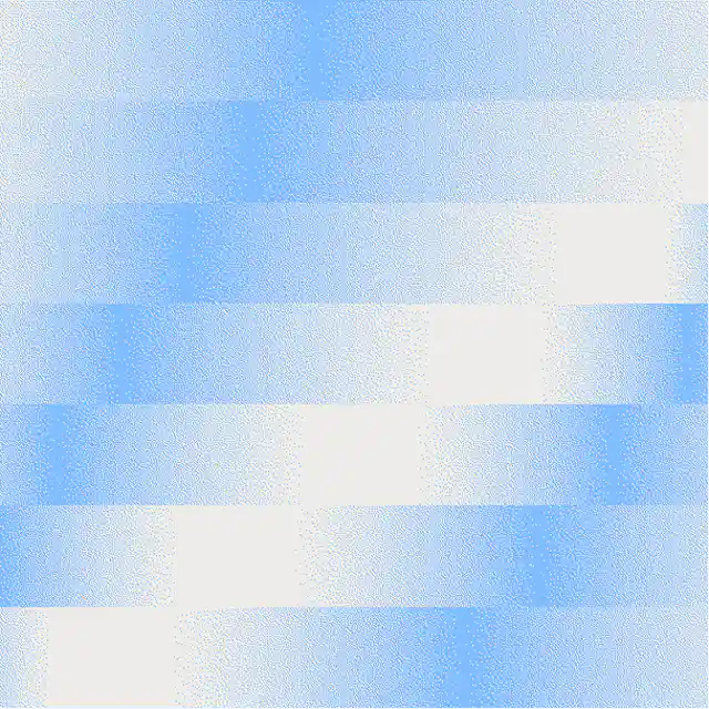
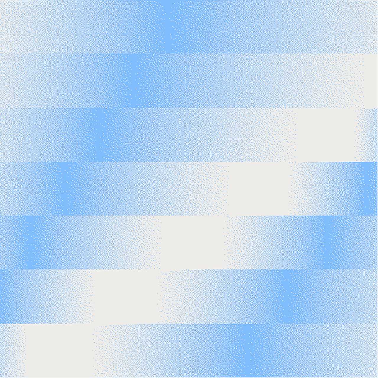
Aunque existen muchas formas de representar datos, se debe aplicar un estilo consistente. Los contornos, las formas geométricas para gráficos y diagramas, los usos sutiles e intencionales de rellenos y los colores son los elementos consistentes en los gráficos de visualización de datos.


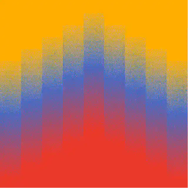
Las cuadrículas de degradado se usan como gráficos coloridos y expresivos, y se emplean de dos maneras:
- Como representaciones localizadas usando los colores de un mapa de un país como base para la transición de degradado.
- Como gráficos ambientales, no ligados a colores específicos, sino simplemente para expresar un estado de ánimo o una energía.
Iconografía
A continuación se presenta un conjunto de productos principales de World y sus respectivos íconos. Los socios también pueden representar a Worldcoin con el logo de World.


A continuación se muestra el conjunto completo de íconos que hay en la actualidad. Se pueden crear (y se crearán) más íconos, pero debe hacerse utilizando las pautas de construcción para mantener la coherencia.


Los íconos de World están diseñados como extensiones de nuestra tipografía, reflejando el grosor de los trazos y las curvas.
Es esencial que todos los íconos emparejados con texto mantengan las mismas proporciones y alineación para ser armónicos con la tipografía. Los íconos están diseñados para que los íconos rectangulares horizontales se alineen con la parte superior e inferior de la altura de las mayúsculas y estén centrados verticalmente.


Tamaño de los íconos
Todos los íconos svg están contenidos en un marco estándar. Para mantener un tamaño consistente con relación a la tipografía, podemos aplicar una fórmula al marco del ícono: multiplicar el tamaño de la fuente por 1,07 para obtener el tamaño del marco del ícono. Ejemplo: si el tamaño de la fuente es 180 px, el marco del ícono debe ser (180 × 1,07) = 192,6 px de ancho.


Recursos
Recursos para imágenes principales, degradado, símbolo de moneda WLD, Orb, World App, World Chain, etc.