Protokół Projektowy World
Zasady, Wytyczne i Zasoby
Zasady Projektu
Ludzki
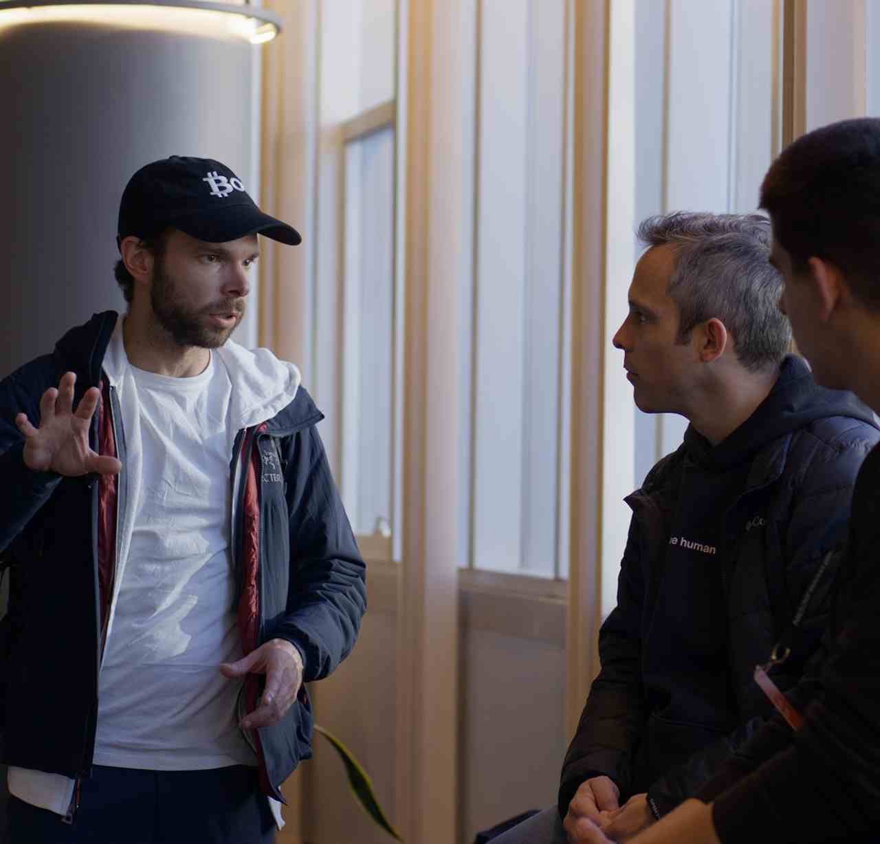
Przekonanie, że naturalne i nieprzewidywalne cechy ludzkie są niezbędne do innowacji.
Uniwersalny
Język wizualny, który zapewnia inkluzywność, dostępność oraz globalne połączenie.
Optymistyczny
Wiara w ludzkość i w rolę, jaką technologia może odgrywać w podnoszeniu jakości życia każdego człowieka.
Przegląd marki
Wszystkie narzędzia istnieją pod parasolem marki głównej, którą jest World.


Identyfikacja Wizualna
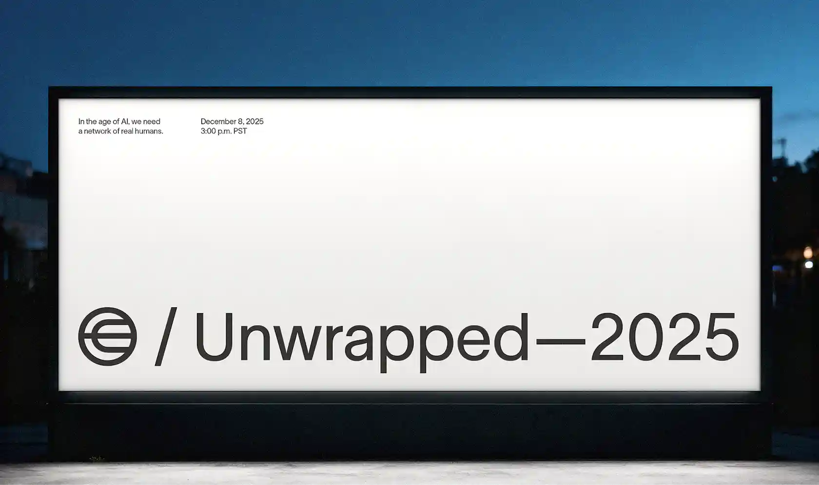
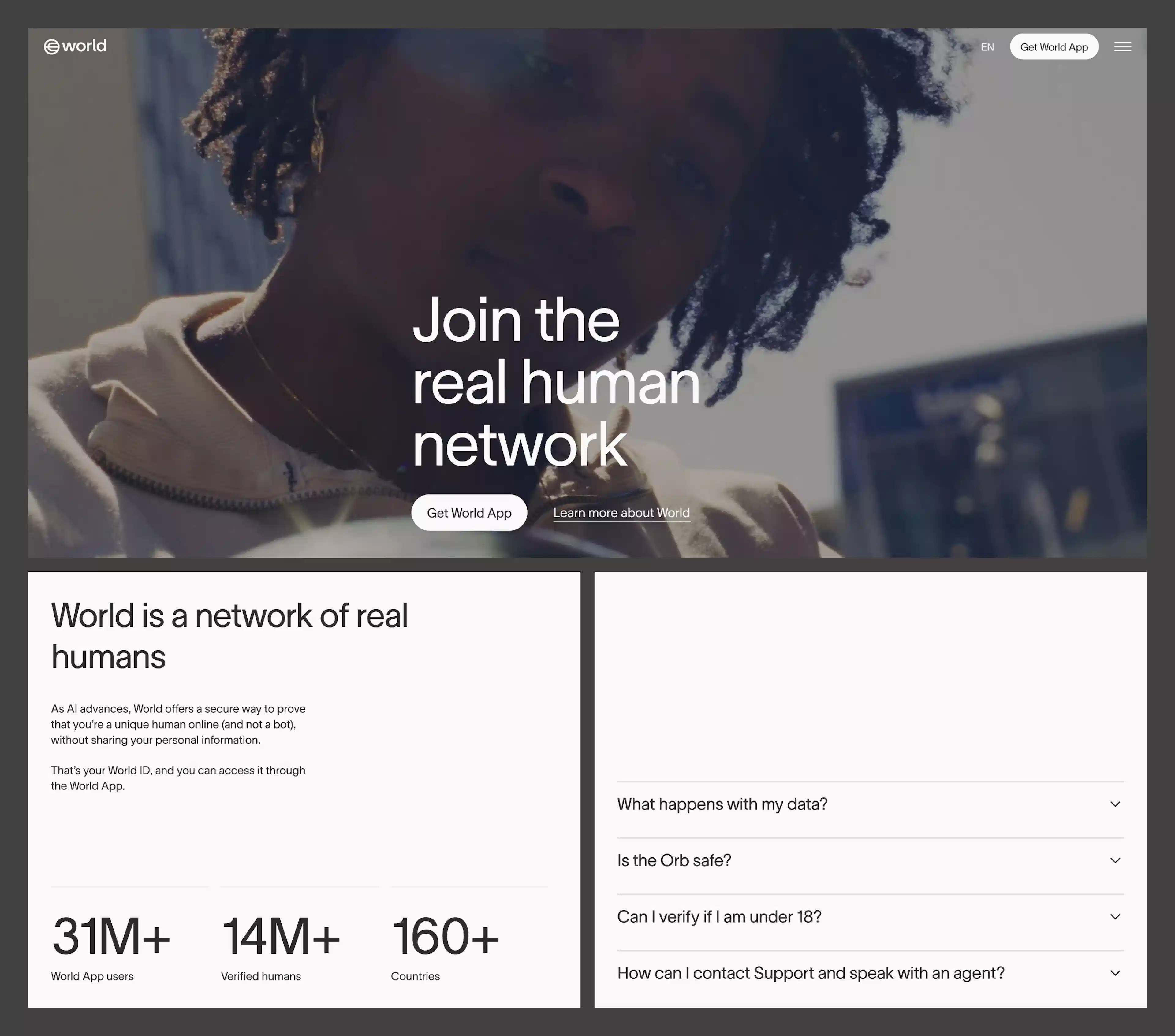
Logo World
Logo World to wizualna kotwica naszej marki — jest proste, czytelne i uniwersalne. Jest oparte na ponadczasowych zasadach projektowania i odzwierciedla nasze zaangażowanie w dostępność, innowacyjność oraz łączenie ludzi na całym świecie.
Nasz znak graficzny jest podstawowym elementem tożsamości naszej marki. Zawsze używaj logo w jego oryginalnej formie i zachowuj wokół niego wolną przestrzeń, aby zapewnić czytelność i wyrazistość. Modyfikacje, zniekształcenia lub użycie niezatwierdzonych kolorów mogą naruszyć jego integralność.


Nasz logotyp jest kluczowym elementem identyfikacji wizualnej naszej marki, współgrającym ze znakiem logo, aby jasno i stylowo komunikować naszą nazwę. Wprowadzanie zmian, rozciąganie lub stosowanie niezatwierdzonych efektów na logotypie jest niedozwolone.


Układ logo łączy symbol logo oraz logotyp w jeden spójny projekt, reprezentując naszą markę w najbardziej kompletnej formie. Połączenia tego należy zawsze używać zgodnie z wytycznymi, zachowując właściwe proporcje, odstępy i ustawienie elementów względem siebie. Unikaj rozdzielania, zmiany rozmieszczenia lub niezależnego skalowania elementów. Zawsze korzystaj z wytycznych dotyczących rozmiaru, odstępów i umiejscowienia, aby zachować spójność.


Obszar ochronny (ang. clearspace) to minimalna przestrzeń między logo a innymi elementami w kompozycji. Szerokość litery „o” w słowie „world” wyznacza wielkość tego odstępu wokół logo
Zasady poprawnego stosowania logo i kolorystyki


Czego Nie Można Robić z Logo i Kolorami


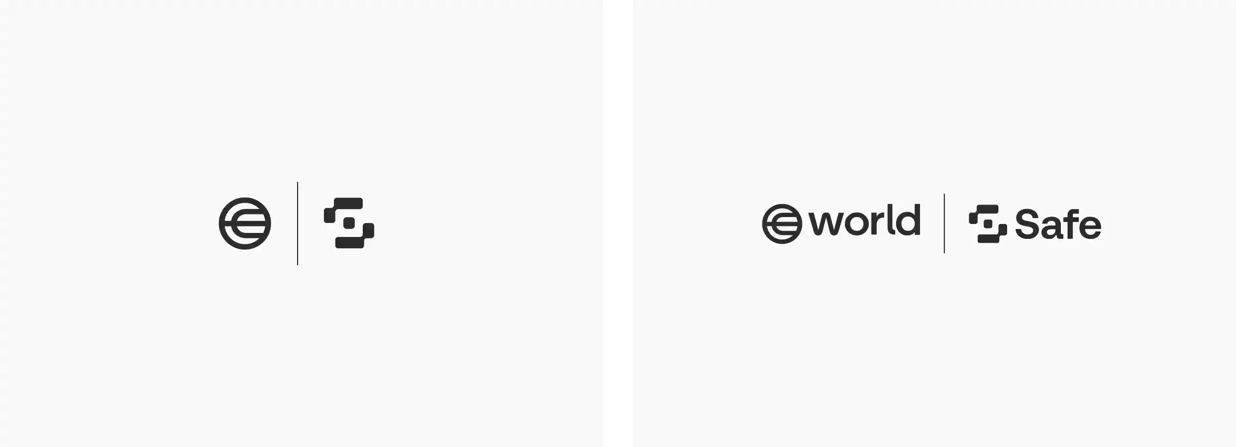
W przypadku prezentowania współpracy partnerskiej logo World może być łączone z logo innej marki w następujących formatach.
Kolory


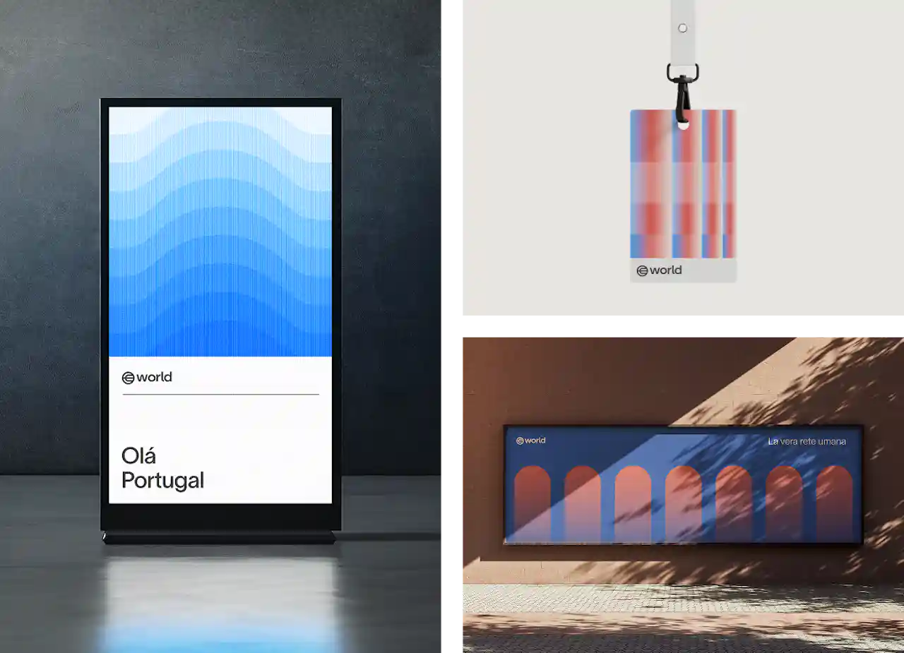
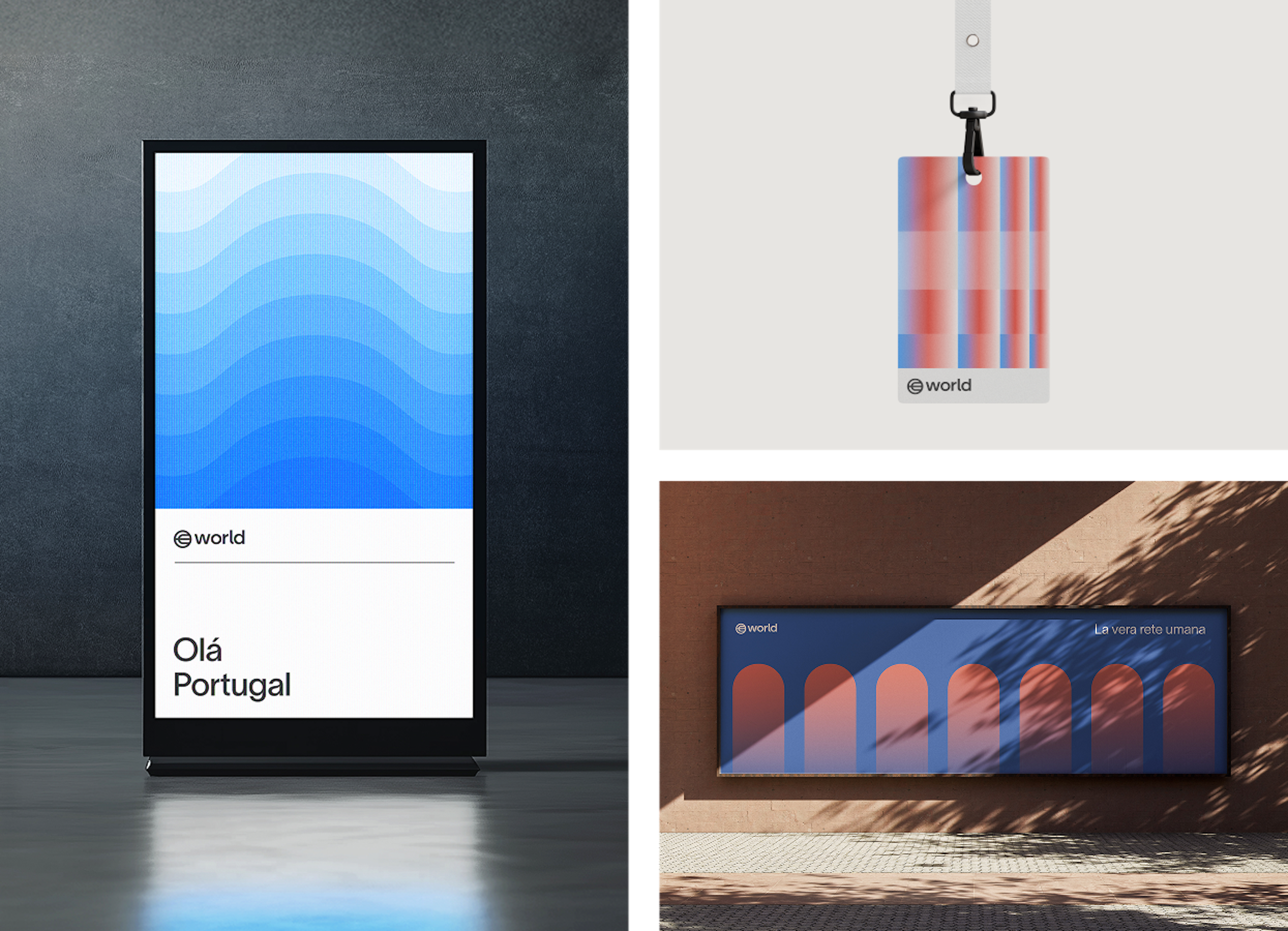
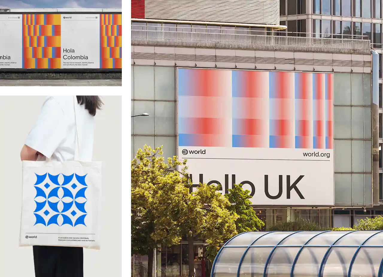
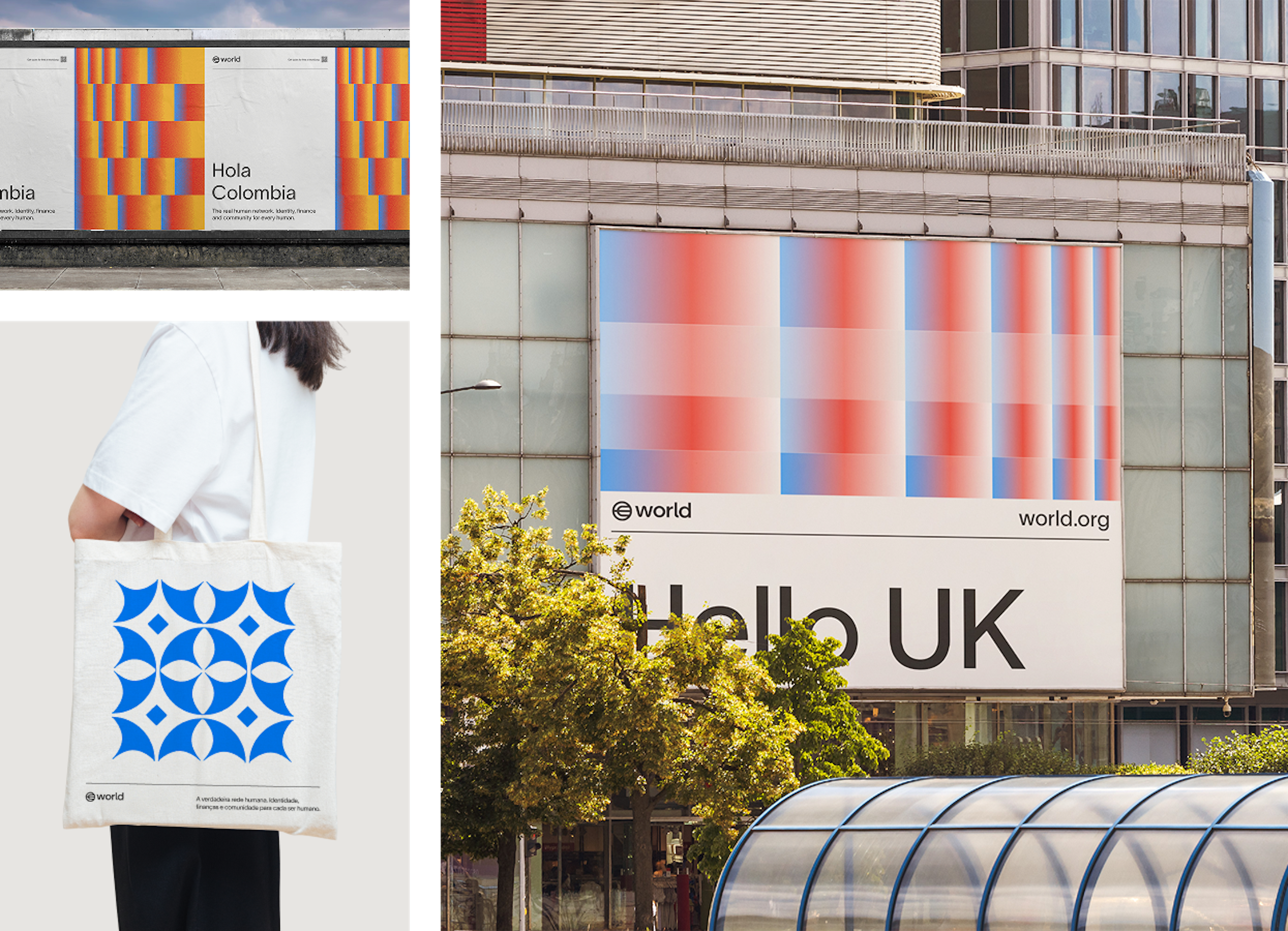
Kolory dodatkowe są wykorzystywane w marce World zarówno w celach ekspresyjnych, jak i użytkowych. Obejmują m. in. kodowanie kolorami różnych poziomów dostępu na identyfikatorach wydarzeń, lokalne gradienty inspirowane barwami flag w materiałach promocyjnych, semantykę kolorów w interfejsach użytkownika oraz ekspresyjne materiały wizualne.
Typografia
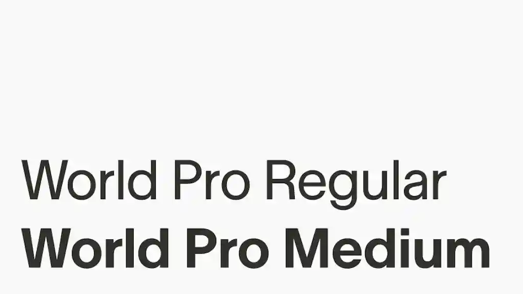
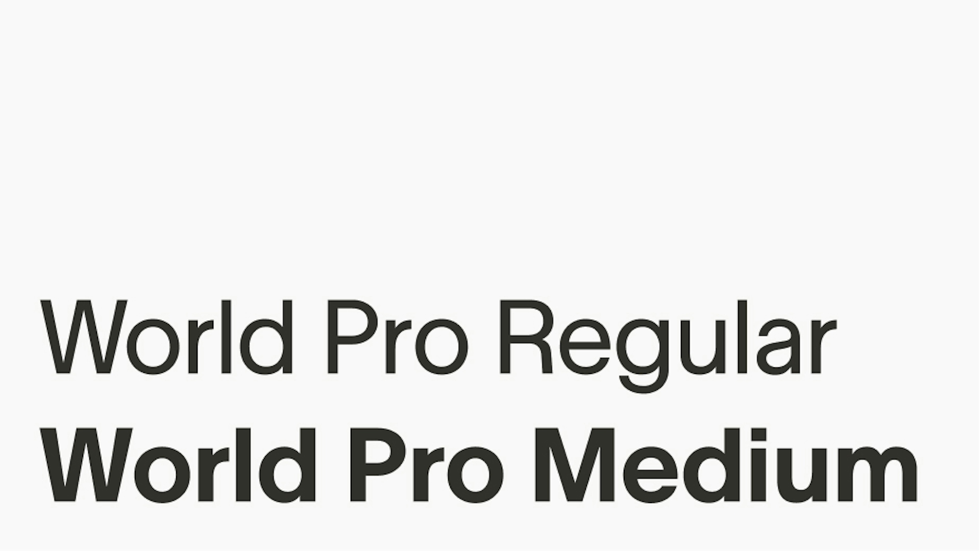
World Pro to czcionka zaprojektowana specjalnie z myślą o skalowalności oraz stworzeniu uniwersalnego systemu wizualnego dla wszystkich użytkowników, integracji i wchodzących w interakcję z World. To jedyny krój pisma wykorzystywany przez markę World.


Grubości pisma
Istnieją dwie grubości czcionki World Pro: Regular oraz Medium. Najczęściej używana jest wersja Regular, a Medium służy jako akcent w przypadkach, kiedy potrzebne jest dodatkowe podkreślenie.
Odstępy między wierszami i literami


Wyrównanie


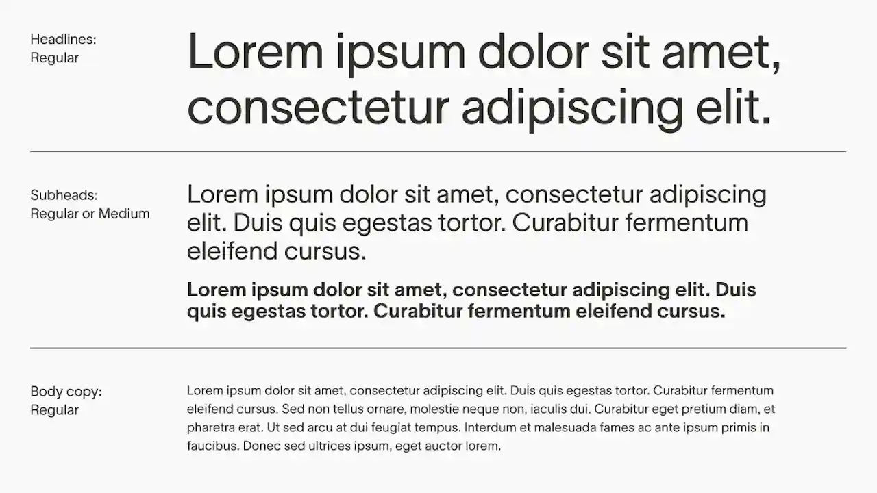
World Pro Regular jest zazwyczaj wystarczająco uniwersalna, by stosować ją zarówno w nagłówkach, jak i w treści głównej, a hierarchia tworzona jest głównie poprzez różnicowanie wielkości.
World Pro Medium można stosować w krótszych podtytułach, gdy wymagany jest większy nacisk wizualny.


Korzystamy z czcionki Noto razem z naszym podstawowym krojem pisma łacińskiego, aby zapewnić wszechstronne wsparcie dla wszystkich skryptów niełacińskich. Noto została wybrana ze względu na swoje szerokie pokrycie języków świata i oferuje spójną i wizualnie harmonijną typografię w różnych pismach, w tym w chińskim, arabskim, cyrylicy i japońskim.
To podejście pozwala nam zachować spójność marki i inkluzywność, zapewniając, że nasza komunikacja dociera do użytkowników na całym świecie w ich rodzimych alfabetach, bez pogorszenia czytelności i spójności estetycznej.


W sytuacjach, gdy World Pro nie jest dostępny, np. w Google Slides, można użyć alternatywnego kroju z biblioteki Google Fonts: w tekście zasadniczym stosuje się czcionkę Inter, natomiast w nagłówkach – Inter Tight. Dozwolone jest użycie wyłącznie tych czcionek z biblioteki Google Fonts i wyłącznie w sytuacji, gdy użycie World Pro jest niemożliwe.


Kompozycja
Siatka to jedno z najważniejszych narzędzi w systemie projektowym. Jest niezbędna we wszystkich układach oraz kompozycjach i powinna być stosowana zawsze. W zależności od rozmiaru obszaru roboczego oraz liczby zawartych w nim elementów może mieć 2, 4, 6 lub 8 kolumn, lecz wszystkie elementy kompozycji powinny być wyrównane do siatki bazowej i rozstawione proporcjonalnie względem marginesów.


Materiały wewnętrzne
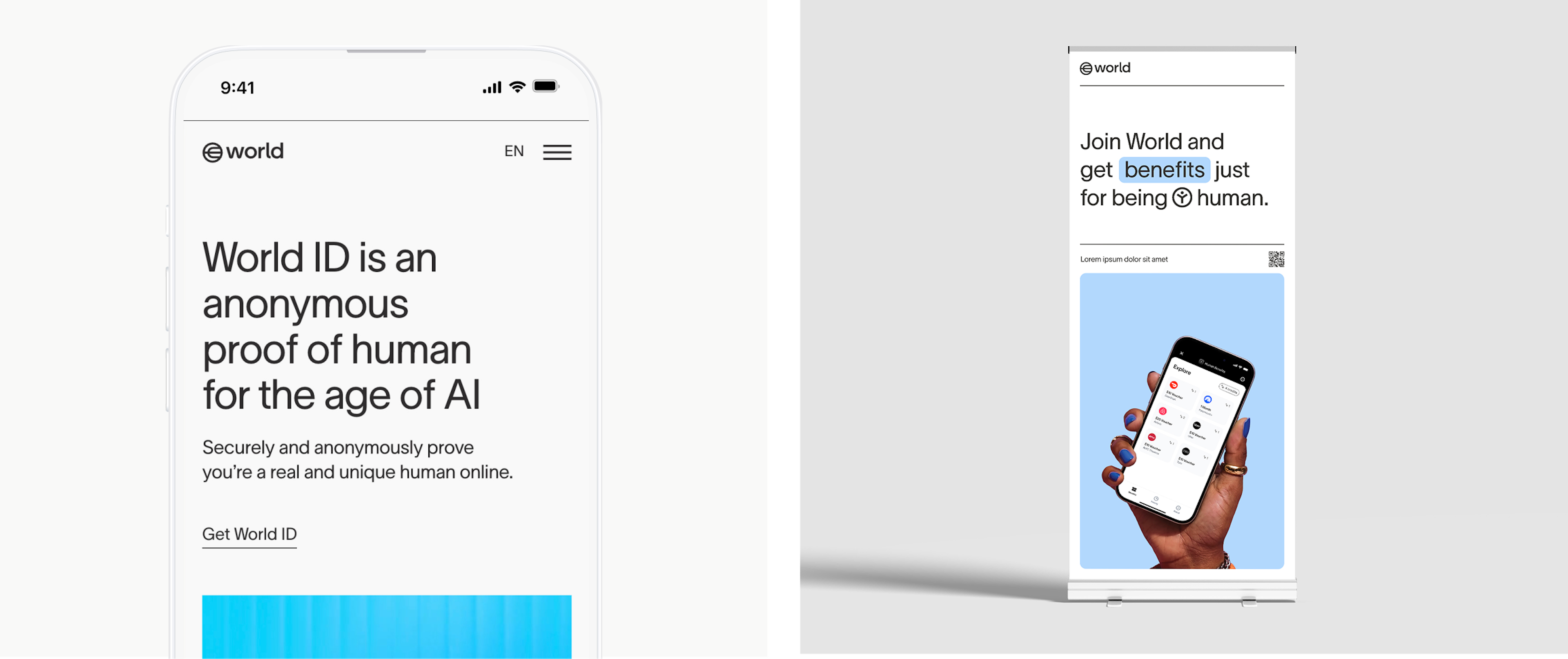
We wszystkich materiałach wewnętrznych i materiałach marki, gdzie logo występuje z innymi elementami i treścią, logo umieszcza się w lewym górnym rogu układu w celu zachowania spójności.


Samodzielna wersja logo
W układach, gdzie logo jest jedynym elementem (jak karty wideo czy wybrane kampanie lub ogłoszenia), logo jest umieszczane w centralnej części układu.


Profile w mediach społecznościowych


Ilustracja
Każdy z głównych produktów World ma przypisaną ilustrację, wynikającą z charakteru produktu lub jego oferty.


Choć istnieje wiele sposobów prezentowania danych, należy zachować spójność stylu. Kontury, kształty geometryczne wykresów i diagramów, subtelne i zamierzone użycia wypełnień oraz koloru to stałe elementy grafiki wizualizacji danych.


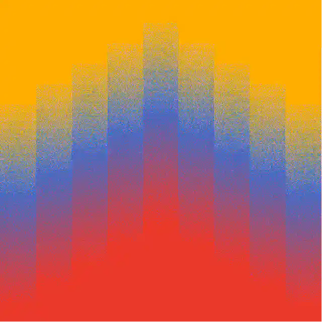
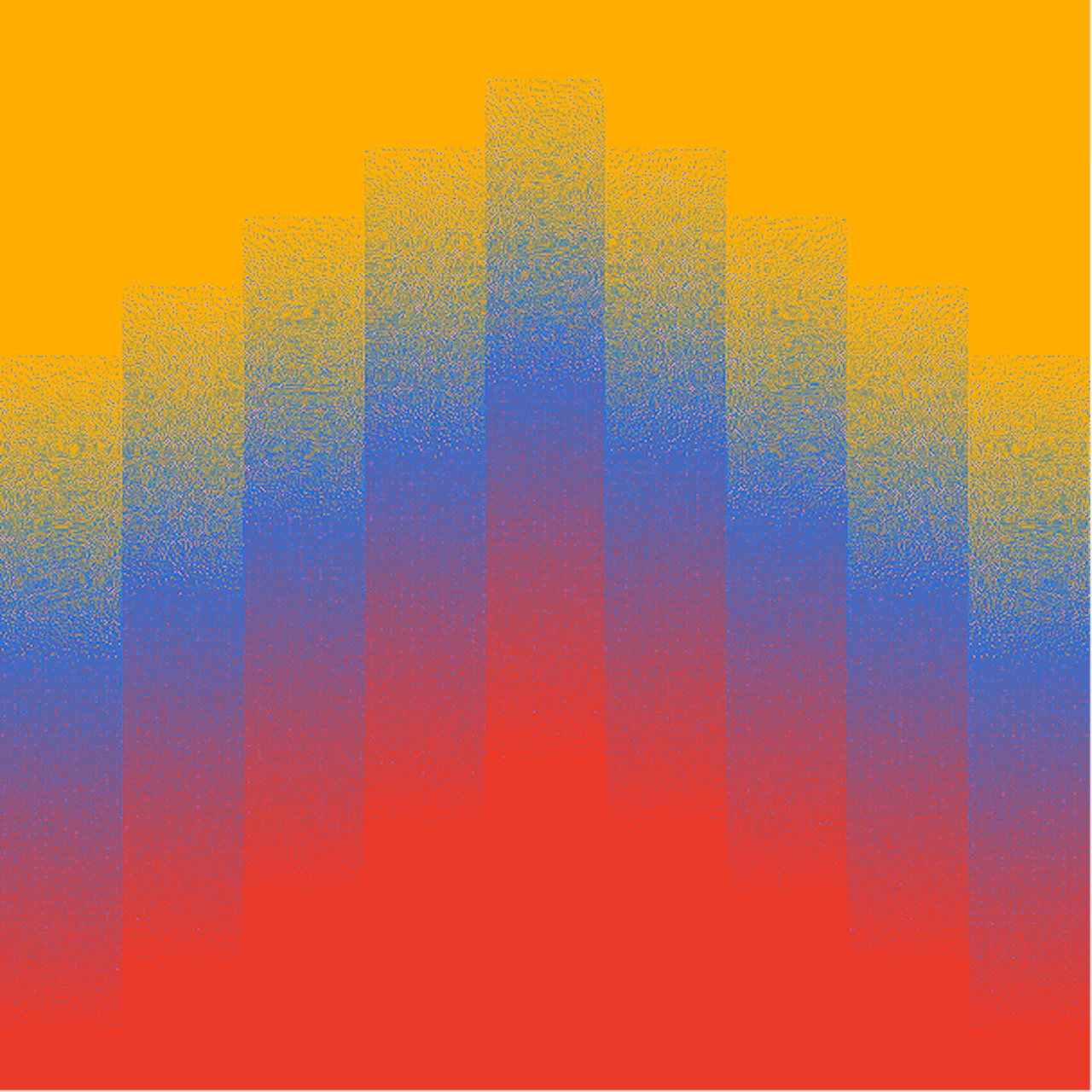
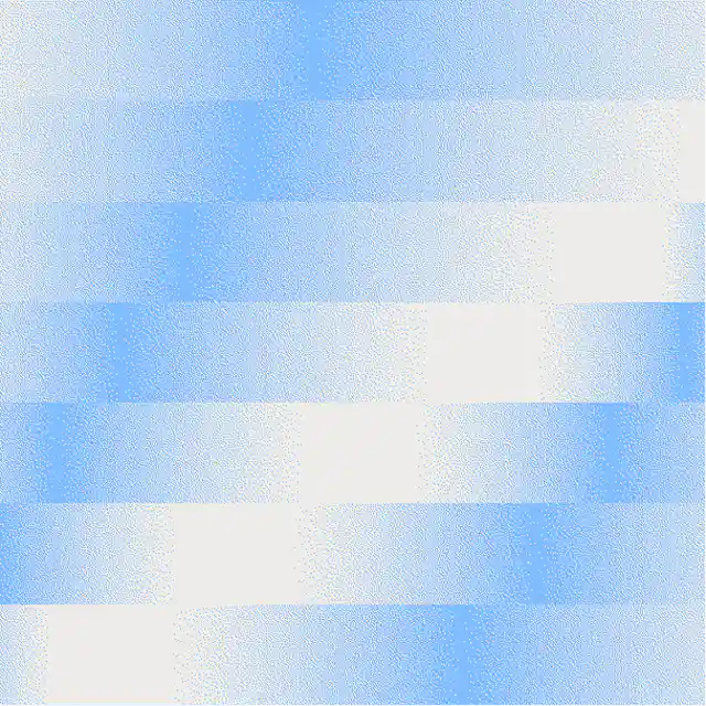
Siatki gradientowe pełnią funkcję kolorowych, ekspresyjnych grafik i używane są na dwa sposoby:
- Jako zlokalizowane odwzorowania z użyciem kolorów mapy danego kraju jako baz dla przejścia gradientu
- Grafiki nastrojowe, niezwiązane z określonymi kolorami, które po prostu wyrażają nastrój lub energię.

Ikonografia
Poniżej znajduje się zestaw podstawowych produktów World oraz odpowiadających im ikon. Partnerzy mogą także przedstawiać Worldcoin za pomocą logotypu World.


Poniżej znajduje się pełny zestaw ikon w aktualnej wersji. W przyszłości mogą być tworzone kolejne ikony, jednak muszą one być tworzone zgodnie z wytycznymi w celu zachowania spójności.


Ikony World są zaprojektowane jako rozszerzenie naszego kroju pisma, naśladując grubość linii oraz krzywizny.
Bardzo ważne jest, by wszystkie ikony zestawiane z tekstem zachowywały te same proporcje i wyrównanie, aby harmonizowały z krojem pisma. Ikony są zaprojektowane w taki sposób, że poziome ikony prostokątne są wyrównane do górnej i dolnej wysokości majuskuł i są wyśrodkowane w pionie.


Rozmiar ikon
Wszystkie ikony SVG znajdują się w standardowej ramce. Aby utrzymać spójny rozmiar względem typografii, można zastosować wzór do ramki ikony: pomnóż rozmiar czcionki przez 1,07, aby uzyskać rozmiar ramki ikony. Np. jeśli rozmiar czcionki to 180px, ramka ikony powinna mieć szerokość (180x1,07)=192,6px.


Zasoby
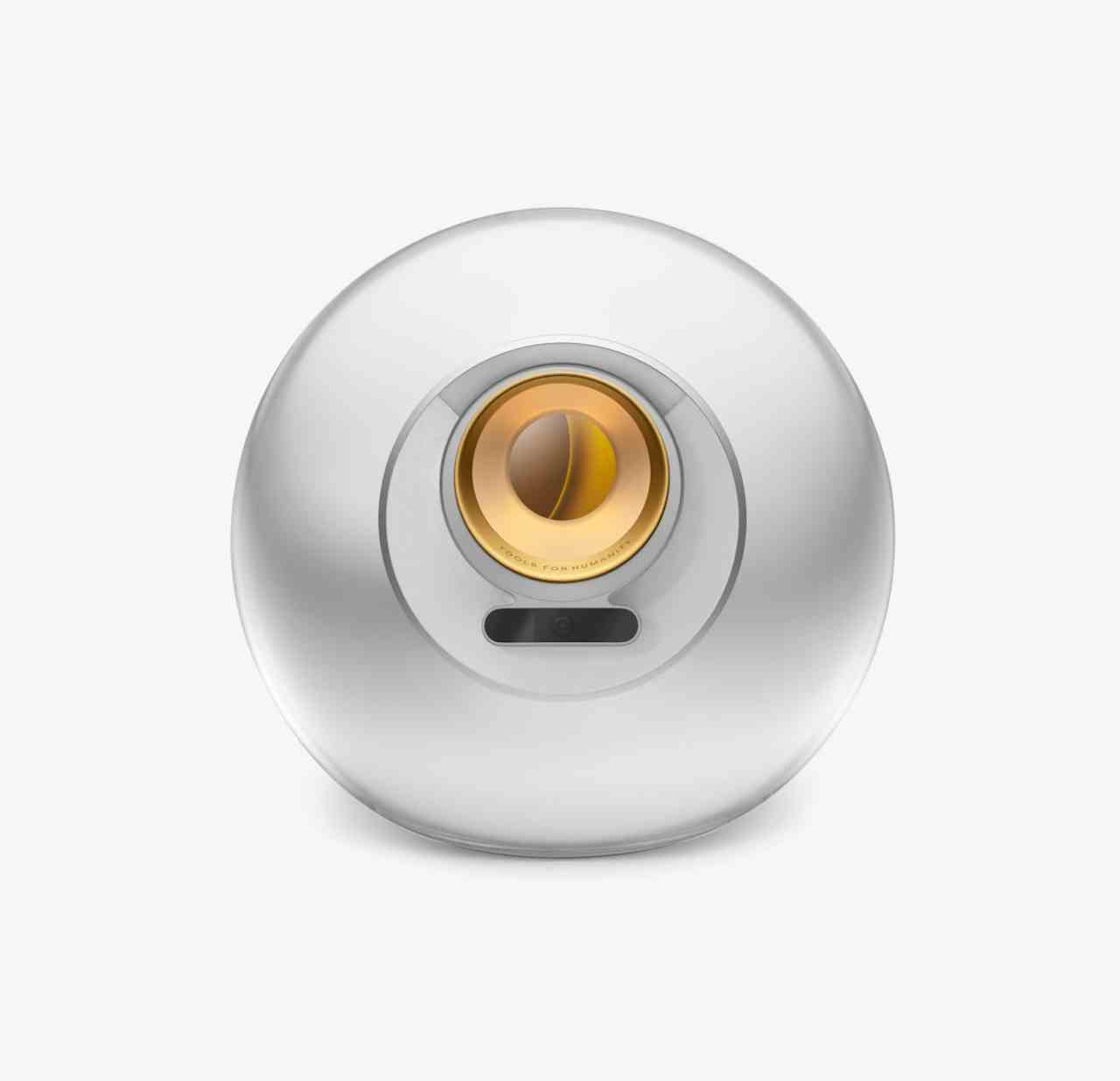
Zasoby dla banerów głównych, gradientu, symbolu waluty WLD, Orba, World App, World Chain itp.