Il protocollo World Design
Principi, linee guida e risorse
Principi di design
Centrato sull'uomo
La convinzione che le qualità organiche e imprevedibili dell'essere umano siano fondamentali per l'innovazione.
Universale
Un linguaggio visivo che garantisce inclusività, accessibilità e connessione globale.
Ottimista
Credere nell'umanità e nel ruolo che la tecnologia può avere nel migliorare la vita di tutti.
Panoramica del marchio
Tutti gli strumenti rientrano sotto l'ombrello del brand principale, ovvero World.


Identità visiva
Logo World
Il logo World è il punto di riferimento visivo del nostro marchio: semplice, chiaro e universale. Basato su principi di design senza tempo, rappresenta il nostro impegno verso l'accessibilità, l'innovazione e la connessione globale.
Il nostro logo è il cuore dell'identità del nostro brand. Usa sempre il logo com'è e lascia un po' di spazio intorno per renderlo più visibile e di maggiore impatto. Modificarlo, distorcerlo o usare colori non autorizzati può rovinarne l'integrità.


Il nostro marchio è una parte importante dell'identità visiva del nostro brande si integra perfettamente con il logo per comunicare il nostro nome in modo chiaro ed elegante. Non si possono fare modifiche, allungamenti o effetti non approvati al marchio.


Il logo lockup mette insieme il simbolo e il marchio in un unico design, che rappresenta il nostro brand nella sua forma più completa. Questo lockup va sempre usato così com'è, mantenendo le giuste proporzioni, spaziature e allineamenti tra gli elementi. Evita di separare, riorganizzare o ridimensionare i componenti da solo. Segui sempre le linee guida per dimensioni, spaziature e posizionamento per mantenere la sua integrità.


Lo spazio libero è la distanza minima tra il logo e qualsiasi altro elemento in un layout. La larghezza della “o” in world definisce lo spazio libero che circonda il logo.
Cosa fare con il logo e i colori


Cosa non fare: Logo e Colore


Quando vuoi mostrare partnership o collaborazioni, il logo World può essere messo insieme al logo di un altro marchio nei seguenti formati.
Colori


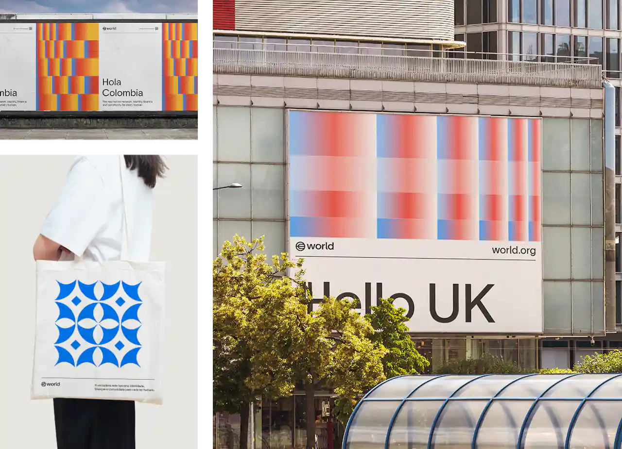
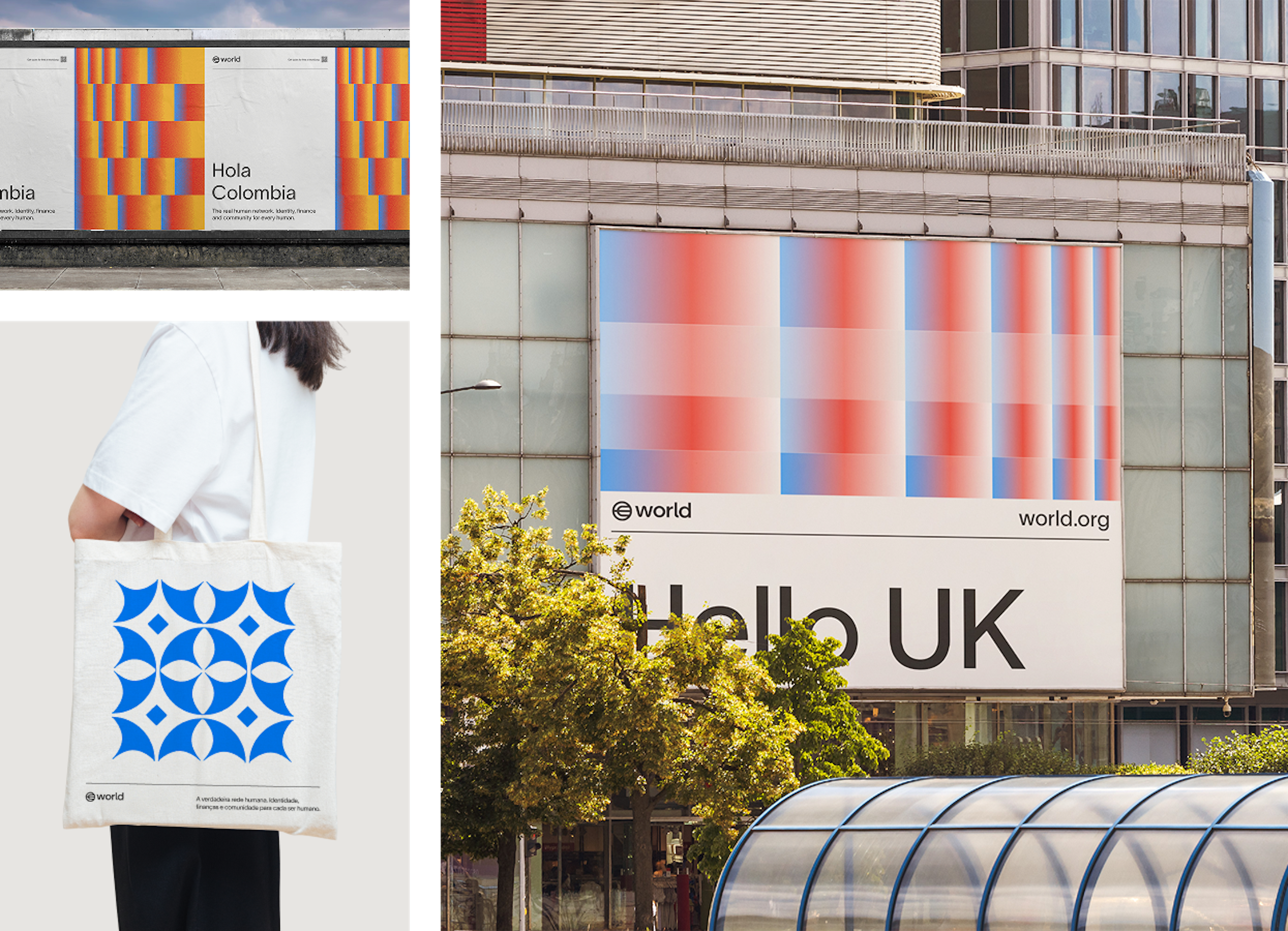
I colori secondari sono usati sia per dare un tocco espressivo che per scopi pratici nel marchio World. Alcuni esempi sono: usare colori diversi per indicare i livelli di autorizzazione nei badge degli eventi, colori sfumati personalizzati per le bandiere nei materiali di lancio, la semantica dei colori nelle interfacce utente e immagini di supporto espressive.
Tipografia
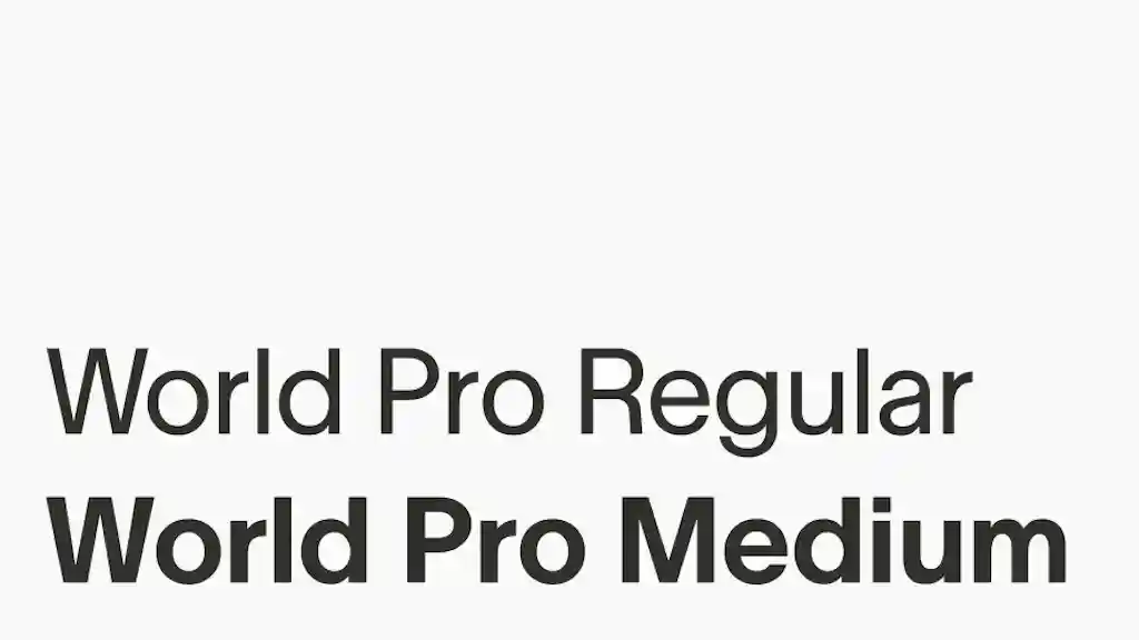
World Pro è stato creato su misura per essere scalabile e fornire un sistema visivo universale per chiunque utilizzi, integri o interagisca con World. È l'unico carattere utilizzato nel brand World.


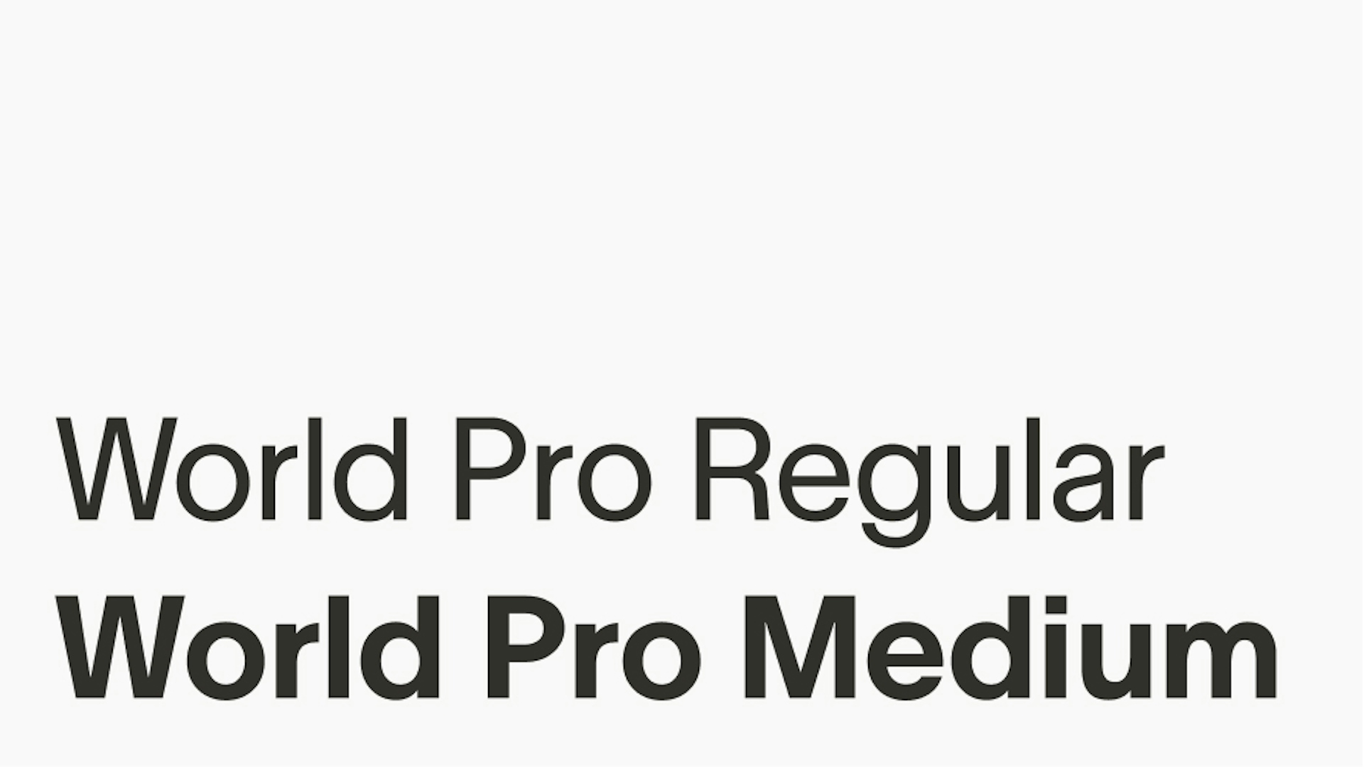
Pesi
Esistono due pesi per World Pro: Regular e Medium. Il Regular è il più comunemente utilizzato, mentre il Medium funge da accento quando è necessaria enfasi.
Le interlinee e il tracciamento


Allineamento


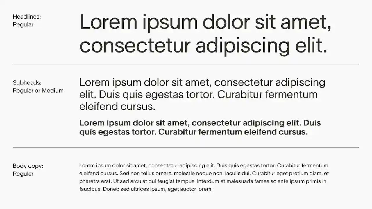
Il World Pro Regular è generalmente considerato abbastanza versatile da adattarsi a titoli e corpo del testo, utilizzando solitamente la scala dimensionale per creare gerarchia.
World Pro Medium può essere utilizzato per sottotitoli più piccoli quando è richiesto un peso maggiore.


Usiamo il font Noto insieme ai nostri caratteri tipografici latini principali per garantire un supporto completo a tutti gli alfabeti non latini. Noto è stato scelto perché copre un sacco di lingue del mondo, offrendo una tipografia coerente e visivamente armoniosa in diversi alfabeti, come cinese, arabo, cirillico e giapponese.
Questo ci permette di mantenere la coerenza e l'inclusività del marchio, assicurando che la nostra comunicazione raggiunga gli utenti di tutto il mondo nelle loro lingue native, senza compromettere la leggibilità o la coerenza estetica.


In situazioni limitate in cui World Pro non è disponibile, ad esempio in Google Presentazioni, è possibile utilizzare un carattere alternativo della libreria Google Fonts: per il corpo del testo si utilizza il font Inter; per i titoli si utilizza il font Inter Tight. Solo questi font della libreria Google Fonts possono essere utilizzati e solo quando non è possibile usare il World Pro.


Composizione
La griglia è uno degli strumenti più importanti nel sistema di progettazione. È fondamentale per tutti i layout e le composizioni e va usata sempre. Che sia una griglia a 2, 4, 6 o 8 colonne dipende dalle dimensioni della tavola da disegno e da quanti elementi ci sono dentro, ma tutti gli elementi in una composizione dovrebbero essere allineati alla griglia sottostante e distanziati in modo proporzionale ai margini.


Materiali interni
Per tutto il materiale interno e il materiale promozionale del marchio, dove il logo compare insieme ad altre risorse e contenuti, il logo va messo nell'angolo in alto a sinistra del layout per garantire la coerenza.


Logo singolo
Nei layout in cui il logo è l'unico elemento, come le schede video o alcune campagne o annunci, il logo viene messo al centro del layout.


Profili social media


Illustrazione
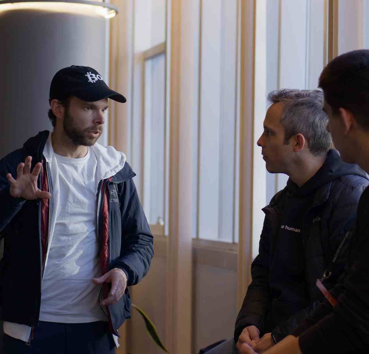
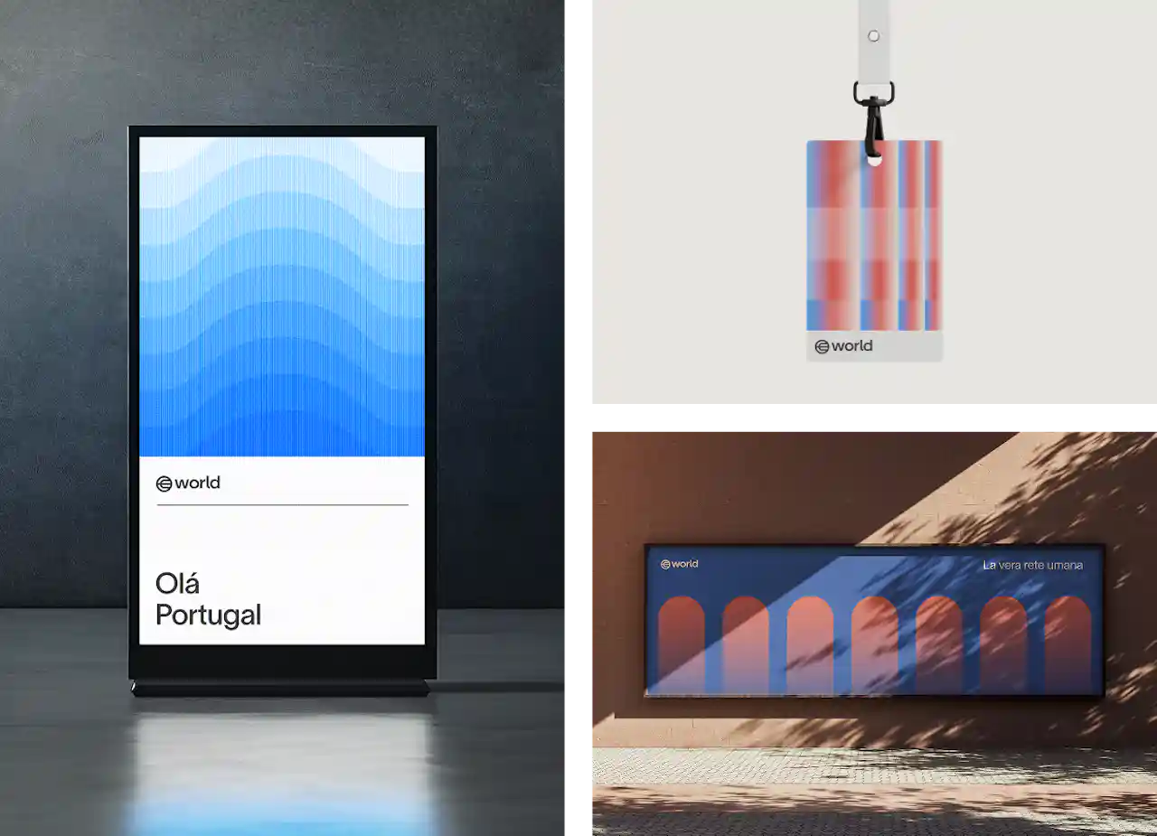
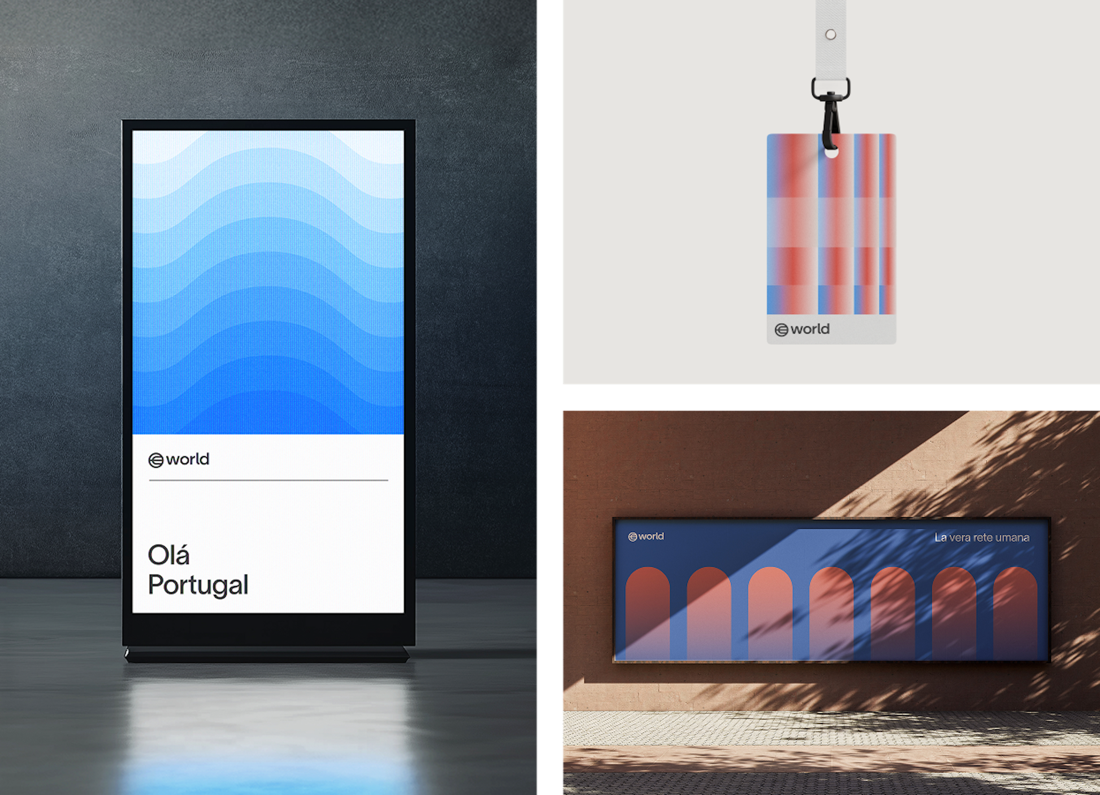
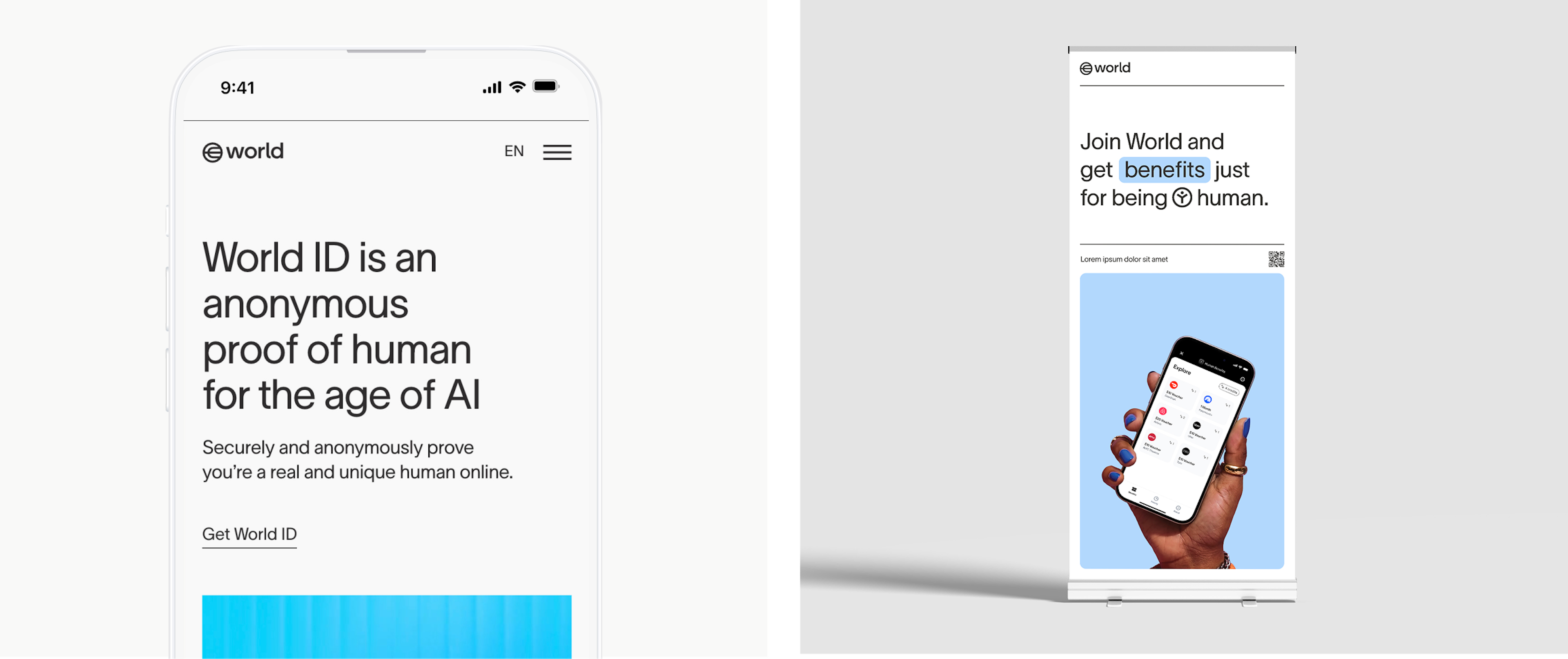
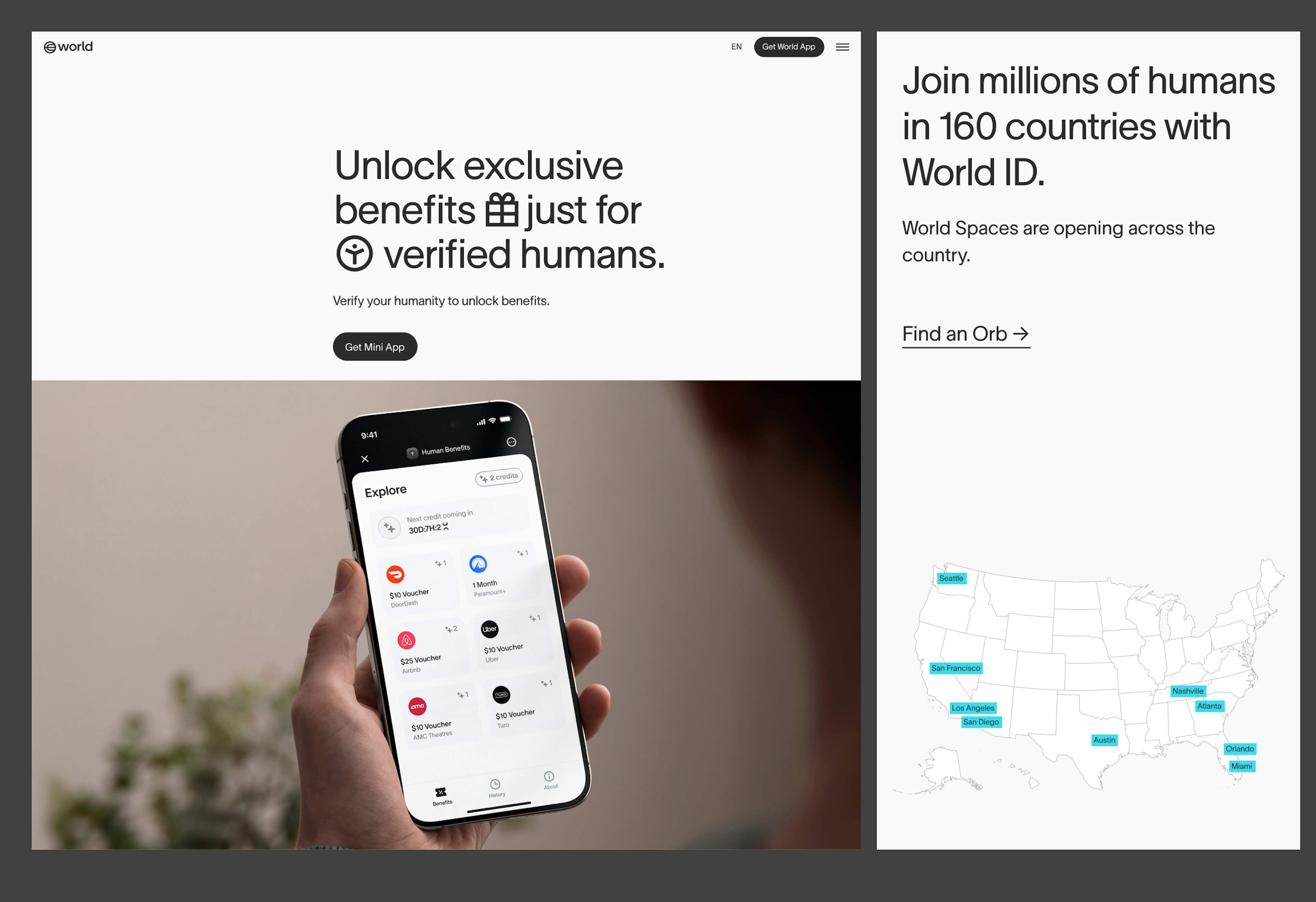
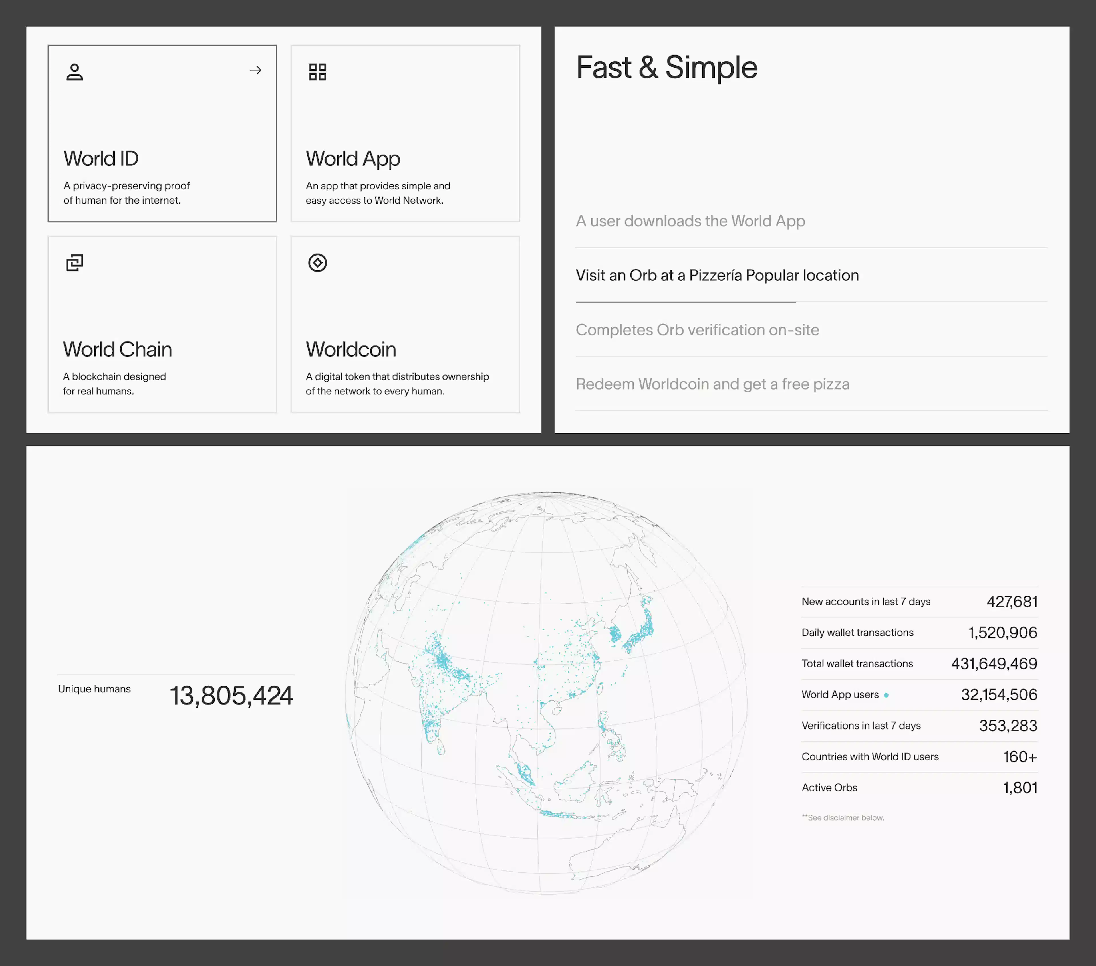
Ogni prodotto principale di World ha un'immagine che lo rappresenta, ispirata alla natura del prodotto o a quello che offre.


Anche se ci sono tanti modi per mostrare i dati, è meglio usare uno stile coerente. Contorni, forme geometriche per grafici e tabelle, l'uso delicato e mirato di riempimenti e colori sono gli elementi che rendono coerente la visualizzazione dei dati.


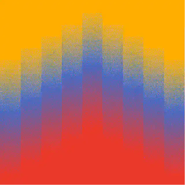
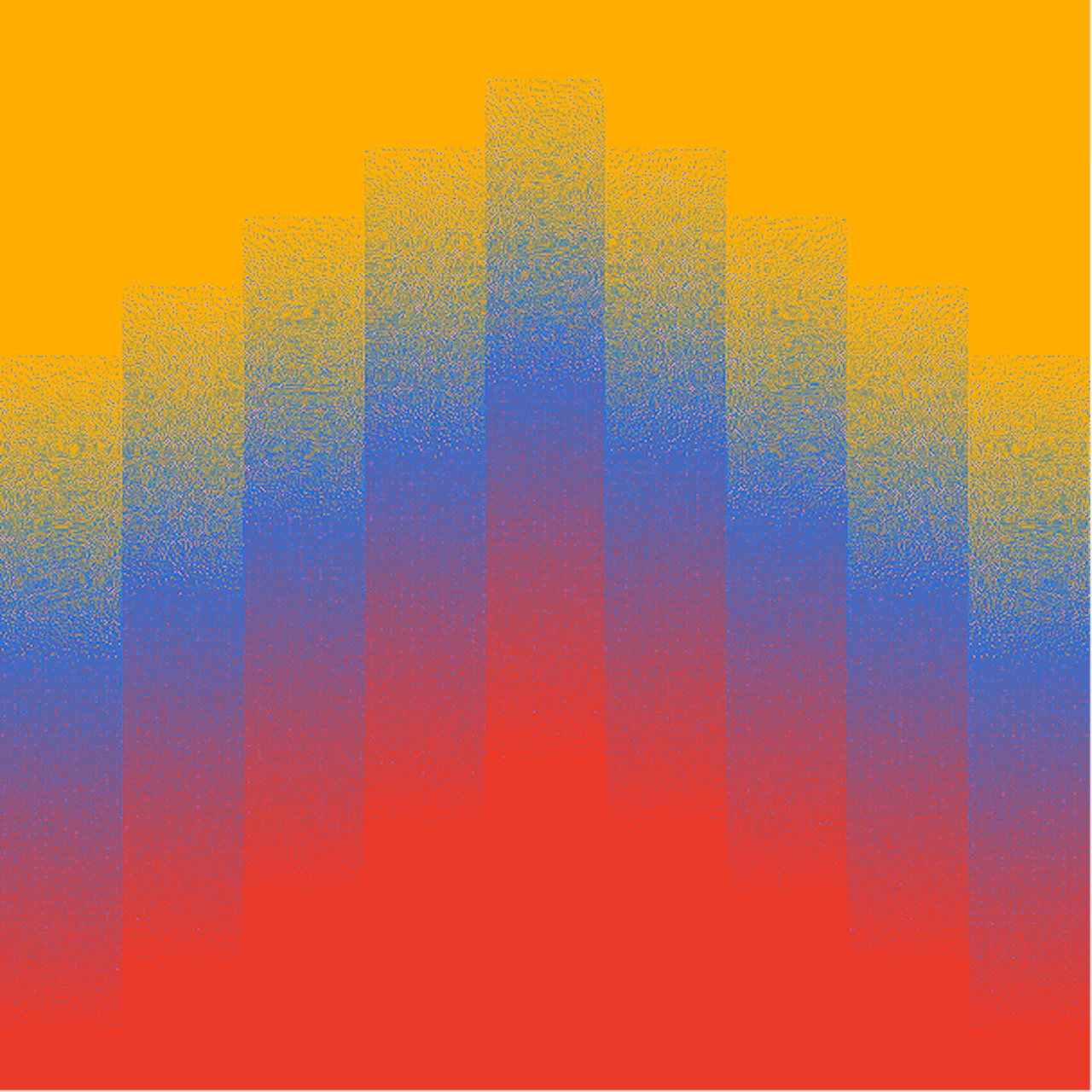
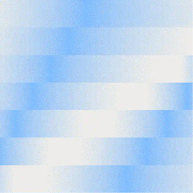
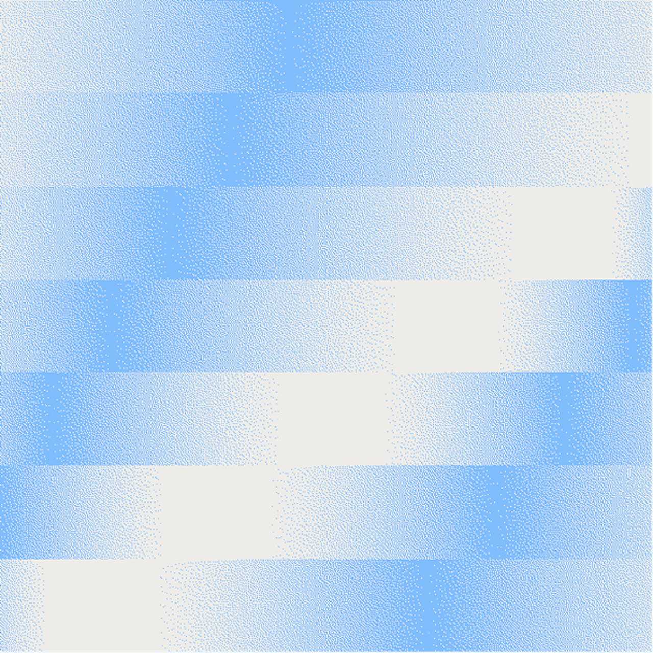
Le griglie a gradiente servono come grafiche colorate ed espressive e sono usate in due modi:
- Rappresentazioni locali che utilizzano i colori della mappa di un paese come input per le transizioni di gradiente
- Grafiche ambientali, non legate a specifici colori ma semplicemente espressive di uno stato d'animo o energia
Iconografia
Di seguito è riportato un set dei prodotti core di World e le relative icone. I partner possono rappresentare Worldcoin anche con il logo World.


Di seguito è riportato il set completo di icone attualmente esistente. Altre icone verranno create in futuro, ma dovranno essere realizzate seguendo le linee guida di costruzione per mantenere la coerenza.


Le icone di World sono progettate come estensioni del nostro carattere, rispecchiandone lo spessore del tratto e le curve.
È essenziale che tutte le icone abbinate al testo mantengano le stesse proporzioni e lo stesso allineamento per essere armoniose con il carattere. Le icone sono progettate in modo che le icone rettangolari orizzontali siano allineate al bordo superiore e inferiore dell'altezza delle maiuscole e siano centrate verticalmente.


Dimensione delle icone
Tutte le icone SVG sono contenute in una cornice standard. Per mantenere una dimensione coerente rispetto alla tipografia, possiamo applicare una formula alla cornice dell'icona: moltiplica la dimensione del carattere per 1,07 per ottenere la dimensione della cornice dell'icona. Ad esempio: se la dimensione del carattere è 180px, la cornice dell'icona deve essere larga (180x1,07)=192,6px.


Risorse
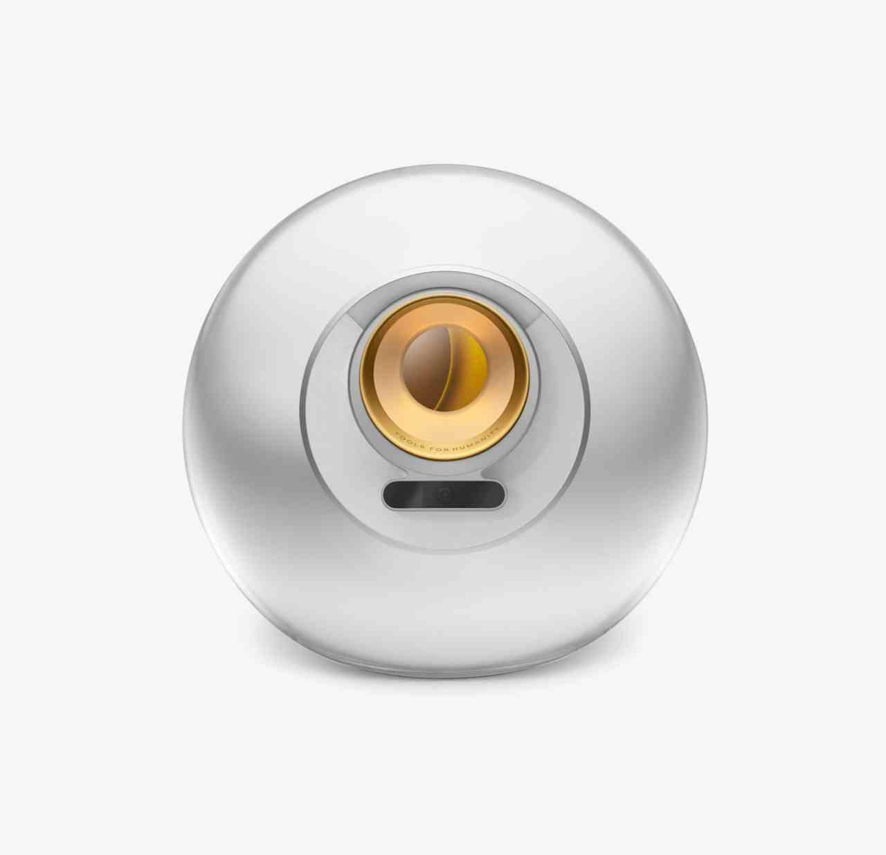
Risorse per immagini hero, sfumature, simbolo della valuta WLD, Orb, World App, World Chain, ecc.